

Minimax M3 的天气卡片和鹈鹕自行车测试
jantrid
2026-06-01 10:06
1
我用的 opencode 提供的 Minimax M3 进行的测试
天气卡片
你是一位就职于苹果公司的顶级前端工程师。请创建一个包含CSS和JavaScript的HTML文件,用于生成动画天气卡片。卡片需要以不同动画效果直观展示以下天气状况:


风力(如:飘动的云朵、摇曳的树木或风线)

降雨(如:下落的雨滴、形成的水洼)

晴天(如:闪耀的光线、明亮的背景)

下雪(如:飘落的雪花、积雪效果)


所有天气卡片需要并排显示,背景采用深色设计。所有HTML、CSS和JavaScript代码都需包含在这个单一文件中。JavaScript部分需包含切换不同天气状态的功能(例如通过函数或按钮组),以演示每种天气的动画效果。


将前端显示效果优化得更精致流畅,打造出价值20元/月的精品天气应用既视感。
效果:思考了443.2秒以后给出结果
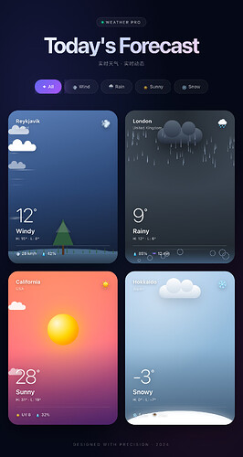
结果代码
<!DOCTYPE html>
<html lang="zh-CN">
<head>
<meta charset="UTF-8">
<meta name="viewport" content="width=device-width, initial-scale=1.0">
<title>Weather Premium · 精品天气应用</title>
<style>
*, *::before, *::after {
margin: 0;
padding: 0;
box-sizing: border-box;
}
html, body {
background: #050816;
font-family: -apple-system, BlinkMacSystemFont, 'SF Pro Display', 'PingFang SC', 'Helvetica Neue', sans-serif;
min-height: 100vh;
color: white;
-webkit-font-smoothing: antialiased;
}
body {
padding: 50px 24px 30px;
background-image:
radial-gradient(ellipse at 15% 20%, rgba(99, 102, 241, 0.18) 0%, transparent 45%),
radial-gradient(ellipse at 85% 80%, rgba(236, 72, 153, 0.12) 0%, transparent 45%),
radial-gradient(ellipse at 50% 50%, rgba(14, 165, 233, 0.06) 0%, transparent 60%);
background-attachment: fixed;
overflow-x: hidden;
}
.container {
max-width: 1400px;
margin: 0 auto;
}
/* Header */
.header {
text-align: center;
margin-bottom: 36px;
}
.header-tag {
display: inline-flex;
align-items: center;
gap: 6px;
padding: 6px 14px;
background: rgba(255, 255, 255, 0.04);
border: 1px solid rgba(255, 255, 255, 0.1);
border-radius: 100px;
font-size: 11px;
letter-spacing: 2px;
color: rgba(255, 255, 255, 0.7);
margin-bottom: 20px;
backdrop-filter: blur(20px);
-webkit-backdrop-filter: blur(20px);
font-weight: 500;
}
.header-tag::before {
content: '';
width: 6px;
height: 6px;
background: #10b981;
border-radius: 50%;
box-shadow: 0 0 8px #10b981;
animation: pulse-dot 2s ease-in-out infinite;
}
@keyframes pulse-dot {
0%, 100% { opacity: 1; transform: scale(1); }
50% { opacity: 0.5; transform: scale(1.2); }
}
.header h1 {
font-size: 64px;
font-weight: 700;
letter-spacing: -3px;
background: linear-gradient(135deg, #ffffff 0%, #c7d2fe 50%, #fbcfe8 100%);
-webkit-background-clip: text;
background-clip: text;
-webkit-text-fill-color: transparent;
margin-bottom: 12px;
line-height: 1;
}
.header p {
color: rgba(255, 255, 255, 0.5);
font-size: 14px;
font-weight: 400;
letter-spacing: 1px;
}
/* Controls */
.controls {
display: flex;
justify-content: center;
gap: 8px;
margin-bottom: 48px;
flex-wrap: wrap;
}
.weather-btn {
padding: 11px 22px;
background: rgba(255, 255, 255, 0.04);
border: 1px solid rgba(255, 255, 255, 0.08);
border-radius: 100px;
color: rgba(255, 255, 255, 0.65);
cursor: pointer;
font-size: 13px;
font-weight: 500;
font-family: inherit;
backdrop-filter: blur(20px);
-webkit-backdrop-filter: blur(20px);
transition: all 0.3s cubic-bezier(0.4, 0, 0.2, 1);
display: flex;
align-items: center;
gap: 6px;
}
.weather-btn:hover {
background: rgba(255, 255, 255, 0.1);
color: white;
transform: translateY(-1px);
border-color: rgba(255, 255, 255, 0.15);
}
.weather-btn.active {
background: linear-gradient(135deg, #6366f1 0%, #a855f7 100%);
border-color: transparent;
color: white;
box-shadow: 0 8px 24px rgba(99, 102, 241, 0.35);
}
/* Grid */
.cards-grid {
display: grid;
grid-template-columns: repeat(4, 1fr);
gap: 22px;
}
@media (max-width: 1100px) {
.cards-grid { grid-template-columns: repeat(2, 1fr); }
}
@media (max-width: 600px) {
.cards-grid { grid-template-columns: 1fr; }
.header h1 { font-size: 42px; }
}
/* Card Base */
.weather-card {
position: relative;
aspect-ratio: 3/4.2;
border-radius: 28px;
overflow: hidden;
cursor: pointer;
transition: all 0.5s cubic-bezier(0.4, 0, 0.2, 1);
box-shadow:
0 20px 50px -10px rgba(0, 0, 0, 0.5),
inset 0 1px 0 rgba(255, 255, 255, 0.1);
isolation: isolate;
}
.weather-card:hover {
transform: translateY(-8px);
box-shadow:
0 30px 70px -10px rgba(0, 0, 0, 0.6),
inset 0 1px 0 rgba(255, 255, 255, 0.15);
}
.weather-card.dimmed {
opacity: 0.25;
transform: scale(0.95);
filter: saturate(0.3);
}
.card-bg {
position: absolute;
inset: 0;
z-index: 1;
}
.card-bg::after {
content: '';
position: absolute;
inset: 0;
background: linear-gradient(180deg, transparent 50%, rgba(0, 0, 0, 0.3) 100%);
pointer-events: none;
}
.card-animation {
position: absolute;
inset: 0;
z-index: 2;
overflow: hidden;
pointer-events: none;
}
.card-content {
position: absolute;
inset: 0;
z-index: 3;
padding: 22px;
display: flex;
flex-direction: column;
justify-content: space-between;
}
/* Common text */
.card-top {
display: flex;
justify-content: space-between;
align-items: flex-start;
}
.location-name {
font-size: 15px;
font-weight: 600;
letter-spacing: 0.2px;
text-shadow: 0 2px 8px rgba(0, 0, 0, 0.4);
}
.location-region {
font-size: 11px;
opacity: 0.7;
margin-top: 3px;
font-weight: 400;
text-shadow: 0 2px 8px rgba(0, 0, 0, 0.4);
}
.weather-emoji {
font-size: 26px;
filter: drop-shadow(0 4px 6px rgba(0, 0, 0, 0.25));
}
.card-bottom { margin-top: auto; }
.temperature {
font-size: 56px;
font-weight: 200;
letter-spacing: -3px;
line-height: 0.9;
text-shadow: 0 4px 16px rgba(0, 0, 0, 0.3);
display: flex;
align-items: flex-start;
}
.temperature sup {
font-size: 26px;
margin-top: 4px;
margin-left: 2px;
font-weight: 300;
}
.weather-type {
font-size: 18px;
font-weight: 600;
margin-top: 10px;
text-shadow: 0 2px 8px rgba(0, 0, 0, 0.3);
letter-spacing: 0.2px;
}
.weather-range {
font-size: 11px;
opacity: 0.8;
margin-top: 4px;
text-shadow: 0 2px 8px rgba(0, 0, 0, 0.3);
font-weight: 500;
}
.weather-stats {
display: flex;
gap: 14px;
margin-top: 14px;
padding-top: 14px;
border-top: 1px solid rgba(255, 255, 255, 0.18);
}
.stat {
display: flex;
align-items: center;
gap: 5px;
font-size: 11px;
opacity: 0.9;
font-weight: 500;
text-shadow: 0 2px 4px rgba(0, 0, 0, 0.3);
}
.stat-icon { font-size: 11px; }
/* ===== WIND CARD ===== */
.wind-card .card-bg {
background: linear-gradient(165deg, #5a7fb8 0%, #2d4a7a 50%, #1a2845 100%);
}
.cloud {
position: absolute;
background: white;
border-radius: 100px;
box-shadow: 0 4px 20px rgba(0, 0, 0, 0.15);
}
.cloud::before, .cloud::after {
content: '';
position: absolute;
background: white;
border-radius: 50%;
}
.cloud-1 {
width: 80px; height: 20px; top: 22%;
animation: cloud-drift 8s linear infinite;
}
.cloud-1::before { width: 28px; height: 28px; top: -14px; left: 12px; }
.cloud-1::after { width: 20px; height: 20px; top: -10px; right: 14px; }
.cloud-2 {
width: 60px; height: 16px; top: 12%;
opacity: 0.7;
animation: cloud-drift 12s linear infinite;
animation-delay: -4s;
}
.cloud-2::before { width: 22px; height: 22px; top: -11px; left: 10px; }
.cloud-2::after { width: 16px; height: 16px; top: -8px; right: 10px; }
.cloud-3 {
width: 50px; height: 14px; top: 35%;
opacity: 0.5;
animation: cloud-drift 10s linear infinite;
animation-delay: -2s;
}
.cloud-3::before { width: 18px; height: 18px; top: -9px; left: 8px; }
.cloud-3::after { width: 14px; height: 14px; top: -6px; right: 8px; }
@keyframes cloud-drift {
0% { transform: translateX(-100px); }
100% { transform: translateX(450px); }
}
.wind-line {
position: absolute;
height: 1.5px;
background: linear-gradient(to right, transparent, rgba(255, 255, 255, 0.7), transparent);
border-radius: 2px;
}
.scenery {
position: absolute;
bottom: 0; left: 0; right: 0;
height: 130px;
}
.ground {
position: absolute;
bottom: 0; left: 0; right: 0;
height: 35px;
background: linear-gradient(to bottom, #4a6b8a 0%, #2c3e50 100%);
}
.ground::before {
content: '';
position: absolute;
top: -8px; left: 0; right: 0;
height: 16px;
background: #4a6b8a;
border-radius: 50% 50% 0 0 / 100% 100% 0 0;
}
.tree {
position: absolute;
bottom: 25px; left: 50%;
transform: translateX(-50%);
transform-origin: bottom center;
animation: tree-sway 3s ease-in-out infinite;
}
.tree-trunk {
width: 6px; height: 32px;
background: linear-gradient(90deg, #3d2817 0%, #5a3a23 50%, #3d2817 100%);
margin: 0 auto;
border-radius: 2px;
}
.tree-top {
width: 0; height: 0;
border-left: 30px solid transparent;
border-right: 30px solid transparent;
border-bottom: 75px solid #2d5a3d;
margin-bottom: -4px;
filter: drop-shadow(0 2px 6px rgba(0, 0, 0, 0.3));
position: relative;
}
.tree-top::before {
content: '';
position: absolute;
top: 8px; left: -22px;
width: 0; height: 0;
border-left: 22px solid transparent;
border-right: 22px solid transparent;
border-bottom: 30px solid rgba(255, 255, 255, 0.15);
}
.grass {
position: absolute;
bottom: 30px;
width: 3px;
background: linear-gradient(to top, #2d5a3d, transparent);
transform-origin: bottom center;
border-radius: 2px;
}
@keyframes tree-sway {
0%, 100% { transform: translateX(-50%) rotate(-3deg); }
50% { transform: translateX(-50%) rotate(3deg); }
}
/* ===== RAIN CARD ===== */
.rain-card .card-bg {
background: linear-gradient(170deg, #485563 0%, #29323c 100%);
}
.rain-card .card-bg::before {
content: '';
position: absolute;
inset: 0;
background: radial-gradient(circle at 50% 0%, rgba(0, 0, 0, 0.5) 0%, transparent 50%);
}
.rain-cloud {
position: absolute;
top: 50px; left: 50%;
transform: translateX(-50%);
width: 130px; height: 45px;
background: linear-gradient(180deg, #5a6878 0%, #2d3748 100%);
border-radius: 50px;
box-shadow:
0 15px 40px rgba(0, 0, 0, 0.5),
inset 0 -8px 16px rgba(0, 0, 0, 0.2),
inset 0 4px 8px rgba(255, 255, 255, 0.05);
}
.rain-cloud::before, .rain-cloud::after {
content: '';
position: absolute;
background: linear-gradient(180deg, #5a6878 0%, #2d3748 100%);
border-radius: 50%;
}
.rain-cloud::before { width: 50px; height: 50px; top: -22px; left: 18px; }
.rain-cloud::after { width: 40px; height: 40px; top: -18px; right: 20px; }
.rain-drop {
position: absolute;
width: 2px;
background: linear-gradient(to bottom, transparent, rgba(174, 194, 224, 0.9));
border-radius: 2px;
}
.lightning {
position: absolute;
top: 100px; left: 50%;
transform: translateX(-50%);
width: 4px; height: 70px;
opacity: 0;
}
.lightning::before {
content: '';
position: absolute;
inset: 0;
background: linear-gradient(to bottom, transparent, #fff, #fbbf24, #fff, transparent);
border-radius: 2px;
box-shadow: 0 0 20px #fbbf24, 0 0 40px #fff;
animation: lightning-flash 5s ease-in-out infinite;
}
@keyframes lightning-flash {
0%, 92%, 96%, 100% { opacity: 0; }
93%, 95% { opacity: 1; }
94% { opacity: 0; }
}
.puddle {
position: absolute;
bottom: 0; left: 0; right: 0;
height: 50px;
background: linear-gradient(to top,
rgba(100, 150, 200, 0.5) 0%,
rgba(100, 150, 200, 0.1) 60%,
transparent 100%);
}
.puddle::before {
content: '';
position: absolute;
top: 8px; left: 10%; right: 10%;
height: 1px;
background: linear-gradient(to right, transparent, rgba(255, 255, 255, 0.3), transparent);
}
.ripple {
position: absolute;
border: 1.5px solid rgba(174, 194, 224, 0.8);
border-radius: 50%;
pointer-events: none;
}
/* ===== SUNNY CARD ===== */
.sunny-card .card-bg {
background: linear-gradient(170deg, #ff8a65 0%, #ff6e7f 50%, #6a3093 100%);
}
.sunny-card .card-bg::before {
content: '';
position: absolute;
inset: 0;
background: radial-gradient(circle at 50% 38%, rgba(255, 235, 150, 0.3) 0%, transparent 60%);
}
.sun {
position: absolute;
top: 38%; left: 50%;
transform: translate(-50%, -50%);
width: 90px; height: 90px;
background: radial-gradient(circle at 30% 30%, #fff7d6 0%, #ffd700 50%, #ff8c00 100%);
border-radius: 50%;
box-shadow:
0 0 50px rgba(255, 215, 0, 0.7),
0 0 100px rgba(255, 140, 0, 0.4),
inset -8px -8px 20px rgba(255, 100, 0, 0.3);
animation: sun-breathe 4s ease-in-out infinite;
}
@keyframes sun-breathe {
0%, 100% {
transform: translate(-50%, -50%) scale(1);
box-shadow:
0 0 50px rgba(255, 215, 0, 0.7),
0 0 100px rgba(255, 140, 0, 0.4),
inset -8px -8px 20px rgba(255, 100, 0, 0.3);
}
50% {
transform: translate(-50%, -50%) scale(1.06);
box-shadow:
0 0 70px rgba(255, 215, 0, 0.85),
0 0 140px rgba(255, 140, 0, 0.5),
inset -8px -8px 20px rgba(255, 100, 0, 0.3);
}
}
.sun-rays {
position: absolute;
top: 38%; left: 50%;
transform: translate(-50%, -50%);
width: 200px; height: 200px;
animation: rays-rotate 30s linear infinite;
}
.ray {
position: absolute;
bottom: 50%; left: 50%;
width: 3px; height: 30px;
background: linear-gradient(to top, transparent, rgba(255, 235, 150, 0.95), rgba(255, 200, 100, 0.6));
border-radius: 2px;
transform: translateX(-50%) rotate(var(--angle));
transform-origin: 50% 100%;
}
@keyframes rays-rotate {
to { transform: translate(-50%, -50%) rotate(360deg); }
}
.sun-cloud {
position: absolute;
background: white;
border-radius: 100px;
opacity: 0.9;
}
.sun-cloud::before, .sun-cloud::after {
content: '';
position: absolute;
background: white;
border-radius: 50%;
}
.sun-cloud-1 {
width: 50px; height: 14px; top: 22%;
animation: cloud-drift 20s linear infinite;
}
.sun-cloud-1::before { width: 20px; height: 20px; top: -10px; left: 8px; }
.sun-cloud-1::after { width: 16px; height: 16px; top: -8px; right: 10px; }
.sun-cloud-2 {
width: 40px; height: 12px; top: 65%;
opacity: 0.6;
animation: cloud-drift 28s linear infinite;
animation-delay: -10s;
}
.sun-cloud-2::before { width: 16px; height: 16px; top: -8px; left: 6px; }
.sun-cloud-2::after { width: 12px; height: 12px; top: -6px; right: 8px; }
/* ===== SNOW CARD ===== */
.snow-card .card-bg {
background: linear-gradient(170deg, #b8d4f0 0%, #8fb8d8 50%, #5a7fa5 100%);
}
.snow-card .card-bg::before {
content: '';
position: absolute;
inset: 0;
background: radial-gradient(circle at 30% 20%, rgba(255, 255, 255, 0.4) 0%, transparent 50%);
}
.snow-cloud {
position: absolute;
top: 40px; left: 50%;
transform: translateX(-50%);
width: 120px; height: 38px;
background: linear-gradient(180deg, #ffffff 0%, #d0dde9 100%);
border-radius: 40px;
box-shadow:
0 10px 30px rgba(0, 0, 0, 0.15),
inset 0 -5px 10px rgba(180, 200, 220, 0.3);
}
.snow-cloud::before, .snow-cloud::after {
content: '';
position: absolute;
background: linear-gradient(180deg, #ffffff 0%, #d0dde9 100%);
border-radius: 50%;
}
.snow-cloud::before { width: 44px; height: 44px; top: -20px; left: 20px; }
.snow-cloud::after { width: 36px; height: 36px; top: -16px; right: 22px; }
.snowflake {
position: absolute;
color: white;
pointer-events: none;
text-shadow: 0 0 6px rgba(255, 255, 255, 0.9);
user-select: none;
will-change: transform;
}
.snow-pile {
position: absolute;
bottom: -10px; left: -10px; right: -10px;
height: 50px;
background: white;
border-radius: 50% 50% 0 0 / 100% 100% 0 0;
box-shadow:
0 -5px 20px rgba(255, 255, 255, 0.4),
inset 0 5px 10px rgba(200, 220, 240, 0.3);
}
.snow-pile::before {
content: '';
position: absolute;
bottom: 0; left: 15%;
width: 30%; height: 18px;
background: white;
border-radius: 50%;
}
.snow-pile::after {
content: '';
position: absolute;
bottom: 0; right: 10%;
width: 28%; height: 14px;
background: white;
border-radius: 50%;
}
/* Footer */
.footer {
text-align: center;
margin-top: 50px;
color: rgba(255, 255, 255, 0.3);
font-size: 11px;
letter-spacing: 3px;
font-weight: 500;
}
</style>
</head>
<body>
<div class="container">
<header class="header">
<div class="header-tag">WEATHER PRO</div>
<h1>Today's Forecast</h1>
<p>实时天气 · 实时动态</p>
</header>
<div class="controls">
<button class="weather-btn active" data-weather="all">
<span>✦</span> All
</button>
<button class="weather-btn" data-weather="wind">
<span>💨</span> Wind
</button>
<button class="weather-btn" data-weather="rain">
<span>🌧</span> Rain
</button>
<button class="weather-btn" data-weather="sunny">
<span>☀️</span> Sunny
</button>
<button class="weather-btn" data-weather="snow">
<span>❄️</span> Snow
</button>
</div>
<div class="cards-grid">
<!-- WIND CARD -->
<div class="weather-card wind-card" data-type="wind">
<div class="card-bg"></div>
<div class="card-animation">
<div class="cloud cloud-1"></div>
<div class="cloud cloud-2"></div>
<div class="cloud cloud-3"></div>
<div class="wind-lines"></div>
<div class="scenery">
<div class="ground"></div>
<div class="tree">
<div class="tree-top"></div>
<div class="tree-trunk"></div>
</div>
<div class="grass-container"></div>
</div>
</div>
<div class="card-content">
<div class="card-top">
<div class="location">
<div class="location-name">Reykjavik</div>
<div class="location-region">Iceland</div>
</div>
<div class="weather-emoji">💨</div>
</div>
<div class="card-bottom">
<div class="temperature">12<sup>°</sup></div>
<div class="weather-type">Windy</div>
<div class="weather-range">H: 15° · L: 8°</div>
<div class="weather-stats">
<div class="stat">
<span class="stat-icon">💨</span>
<span>28 km/h</span>
</div>
<div class="stat">
<span class="stat-icon">💧</span>
<span>42%</span>
</div>
</div>
</div>
</div>
</div>
<!-- RAIN CARD -->
<div class="weather-card rain-card" data-type="rain">
<div class="card-bg"></div>
<div class="card-animation">
<div class="rain-cloud"></div>
<div class="lightning"></div>
<div class="rain-container"></div>
<div class="puddle">
<div class="ripples"></div>
</div>
</div>
<div class="card-content">
<div class="card-top">
<div class="location">
<div class="location-name">London</div>
<div class="location-region">United Kingdom</div>
</div>
<div class="weather-emoji">🌧</div>
</div>
<div class="card-bottom">
<div class="temperature">9<sup>°</sup></div>
<div class="weather-type">Rainy</div>
<div class="weather-range">H: 12° · L: 6°</div>
<div class="weather-stats">
<div class="stat">
<span class="stat-icon">💧</span>
<span>85%</span>
</div>
<div class="stat">
<span class="stat-icon">☔</span>
<span>12 mm</span>
</div>
</div>
</div>
</div>
</div>
<!-- SUNNY CARD -->
<div class="weather-card sunny-card" data-type="sunny">
<div class="card-bg"></div>
<div class="card-animation">
<div class="sun-rays"></div>
<div class="sun"></div>
<div class="sun-cloud sun-cloud-1"></div>
<div class="sun-cloud sun-cloud-2"></div>
</div>
<div class="card-content">
<div class="card-top">
<div class="location">
<div class="location-name">California</div>
<div class="location-region">USA</div>
</div>
<div class="weather-emoji">☀️</div>
</div>
<div class="card-bottom">
<div class="temperature">28<sup>°</sup></div>
<div class="weather-type">Sunny</div>
<div class="weather-range">H: 31° · L: 19°</div>
<div class="weather-stats">
<div class="stat">
<span class="stat-icon">☀️</span>
<span>UV 8</span>
</div>
<div class="stat">
<span class="stat-icon">💧</span>
<span>32%</span>
</div>
</div>
</div>
</div>
</div>
<!-- SNOW CARD -->
<div class="weather-card snow-card" data-type="snow">
<div class="card-bg"></div>
<div class="card-animation">
<div class="snow-cloud"></div>
<div class="snow-container"></div>
<div class="snow-pile"></div>
</div>
<div class="card-content">
<div class="card-top">
<div class="location">
<div class="location-name">Hokkaido</div>
<div class="location-region">Japan</div>
</div>
<div class="weather-emoji">❄️</div>
</div>
<div class="card-bottom">
<div class="temperature">-3<sup>°</sup></div>
<div class="weather-type">Snowy</div>
<div class="weather-range">H: 0° · L: -7°</div>
<div class="weather-stats">
<div class="stat">
<span class="stat-icon">❄️</span>
<span>5 cm</span>
</div>
<div class="stat">
<span class="stat-icon">👁</span>
<span>2 km</span>
</div>
</div>
</div>
</div>
</div>
</div>
<p class="footer">DESIGNED WITH PRECISION · 2024</p>
</div>
<script>
(function () {
'use strict';
// Inject dynamic keyframes
const style = document.createElement('style');
style.textContent = `
@keyframes wind-line-blow {
0% { transform: translateX(-120px); opacity: 0; }
15% { opacity: 1; }
85% { opacity: 1; }
100% { transform: translateX(420px); opacity: 0; }
}
@keyframes rain-fall {
0% { transform: translateY(0) translateX(0); opacity: 0; }
10% { opacity: 1; }
100% { transform: translateY(450px) translateX(-25px); opacity: 0.2; }
}
@keyframes ripple-expand {
0% { transform: scale(0); opacity: 1; }
100% { transform: scale(2.5); opacity: 0; }
}
@keyframes snow-fall {
0% { transform: translateY(-30px) translateX(0) rotate(0deg); opacity: 0; }
10% { opacity: 1; }
90% { opacity: 0.7; }
100% { transform: translateY(500px) translateX(40px) rotate(360deg); opacity: 0; }
}
@keyframes grass-wave {
0%, 100% { transform: rotate(-18deg); }
50% { transform: rotate(18deg); }
}
`;
document.head.appendChild(style);
// Create wind lines
function createWindLines(card) {
const container = card.querySelector('.wind-lines');
const lineCount = 10;
for (let i = 0; i < lineCount; i++) {
const line = document.createElement('div');
line.className = 'wind-line';
line.style.top = (Math.random() * 70 + 5) + '%';
line.style.width = (Math.random() * 60 + 30) + 'px';
line.style.opacity = (Math.random() * 0.5 + 0.3).toString();
const duration = Math.random() * 1.5 + 1.5;
const delay = Math.random() * 3;
line.style.animation = `wind-line-blow ${duration}s linear infinite`;
line.style.animationDelay = `${delay}s`;
container.appendChild(line);
}
}
// Create grass
function createGrass(card) {
const container = card.querySelector('.grass-container');
const grassCount = 14;
for (let i = 0; i < grassCount; i++) {
const grass = document.createElement('div');
grass.className = 'grass';
grass.style.left = (3 + i * 7 + Math.random() * 2) + '%';
grass.style.height = (Math.random() * 15 + 10) + 'px';
const duration = Math.random() * 0.4 + 1.2;
const delay = Math.random() * 0.5;
grass.style.animation = `grass-wave ${duration}s ease-in-out infinite`;
grass.style.animationDelay = `${delay}s`;
container.appendChild(grass);
}
}
// Create raindrops + ripples
function createRain(card) {
const container = card.querySelector('.rain-container');
const dropCount = 60;
for (let i = 0; i < dropCount; i++) {
const drop = document.createElement('div');
drop.className = 'rain-drop';
drop.style.left = (Math.random() * 100) + '%';
drop.style.top = (Math.random() * 20 + 12) + '%';
drop.style.height = (Math.random() * 18 + 10) + 'px';
drop.style.opacity = (Math.random() * 0.5 + 0.4).toString();
const duration = Math.random() * 0.6 + 0.5;
const delay = Math.random() * 1.5;
drop.style.animation = `rain-fall ${duration}s linear infinite`;
drop.style.animationDelay = `${delay}s`;
container.appendChild(drop);
}
const rippleContainer = card.querySelector('.ripples');
const rippleCount = 8;
for (let i = 0; i < rippleCount; i++) {
const ripple = document.createElement('div');
ripple.className = 'ripple';
ripple.style.left = (Math.random() * 80 + 10) + '%';
ripple.style.bottom = (Math.random() * 20 + 5) + 'px';
const size = Math.random() * 12 + 8;
ripple.style.width = size + 'px';
ripple.style.height = size + 'px';
const duration = Math.random() * 1 + 1.5;
const delay = Math.random() * 3;
ripple.style.animation = `ripple-expand ${duration}s ease-out infinite`;
ripple.style.animationDelay = `${delay}s`;
rippleContainer.appendChild(ripple);
}
}
// Create sun rays
function createSunRays(card) {
const container = card.querySelector('.sun-rays');
const rayCount = 12;
for (let i = 0; i < rayCount; i++) {
const ray = document.createElement('div');
ray.className = 'ray';
ray.style.setProperty('--angle', `${i * (360 / rayCount)}deg`);
container.appendChild(ray);
}
}
// Create snowflakes
function createSnow(card) {
const container = card.querySelector('.snow-container');
const flakes = ['❄', '❅', '❆', '✻', '✼', '·'];
const flakeCount = 50;
for (let i = 0; i < flakeCount; i++) {
const flake = document.createElement('div');
flake.className = 'snowflake';
flake.textContent = flakes[Math.floor(Math.random() * flakes.length)];
flake.style.left = (Math.random() * 100) + '%';
flake.style.top = '-20px';
const size = Math.random() * 12 + 8;
flake.style.fontSize = size + 'px';
flake.style.opacity = (Math.random() * 0.5 + 0.5).toString();
const duration = Math.random() * 4 + 5;
const delay = Math.random() * 8;
flake.style.animation = `snow-fall ${duration}s linear infinite`;
flake.style.animationDelay = `${delay}s`;
container.appendChild(flake);
}
}
// Initialize all cards
function initCards() {
document.querySelectorAll('.weather-card').forEach(card => {
const type = card.dataset.type;
if (type === 'wind') {
createWindLines(card);
createGrass(card);
} else if (type === 'rain') {
createRain(card);
} else if (type === 'sunny') {
createSunRays(card);
} else if (type === 'snow') {
createSnow(card);
}
});
}
// Filter controls
function initControls() {
const buttons = document.querySelectorAll('.weather-btn');
const cards = document.querySelectorAll('.weather-card');
buttons.forEach(btn => {
btn.addEventListener('click', () => {
const weather = btn.dataset.weather;
buttons.forEach(b => b.classList.remove('active'));
btn.classList.add('active');
cards.forEach(card => {
if (weather === 'all' || card.dataset.type === weather) {
card.classList.remove('dimmed');
} else {
card.classList.add('dimmed');
}
});
});
});
// Click on card to focus that weather
cards.forEach(card => {
card.addEventListener('click', () => {
const type = card.dataset.type;
const targetBtn = document.querySelector(`.weather-btn[data-weather="${type}"]`);
if (targetBtn) targetBtn.click();
});
});
}
// Auto-update temperature numbers (subtle live feel)
function initLiveNumbers() {
const temps = document.querySelectorAll('.temperature');
setInterval(() => {
temps.forEach(t => {
if (Math.random() > 0.7) {
t.style.transition = 'transform 0.5s ease';
t.style.transform = 'scale(1.02)';
setTimeout(() => { t.style.transform = 'scale(1)'; }, 500);
}
});
}, 3000);
}
// Boot
initCards();
initControls();
initLiveNumbers();
})();
</script>
</body>
</html>
鹈鹕自行车
画一个鹈鹕骑自行车的svg
效果:思考了130.5秒以后给出结果
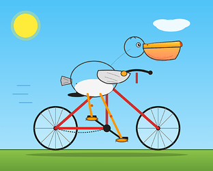
结果代码
<svg viewBox="0 0 500 400" xmlns="http://www.w3.org/2000/svg">

  <defs>

    <linearGradient id="sky" x1="0" y1="0" x2="0" y2="1">

      <stop offset="0%" stop-color="#4FC3F7"/>

      <stop offset="100%" stop-color="#B3E5FC"/>

    </linearGradient>

    <linearGradient id="ground" x1="0" y1="0" x2="0" y2="1">

      <stop offset="0%" stop-color="#8BC34A"/>

      <stop offset="100%" stop-color="#689F38"/>

    </linearGradient>

    <linearGradient id="body" x1="0" y1="0" x2="0" y2="1">

      <stop offset="0%" stop-color="#FFFFFF"/>

      <stop offset="100%" stop-color="#E0E0E0"/>

    </linearGradient>

    <linearGradient id="beak" x1="0" y1="0" x2="0" y2="1">

      <stop offset="0%" stop-color="#FFD54F"/>

      <stop offset="100%" stop-color="#FF9800"/>

    </linearGradient>

    <linearGradient id="pouch" x1="0" y1="0" x2="0" y2="1">

      <stop offset="0%" stop-color="#FFB74D"/>

      <stop offset="100%" stop-color="#FF8A65"/>

    </linearGradient>

  </defs>

  <!-- 天空 -->

  <rect width="500" height="400" fill="url(#sky)"/>

  <!-- 太阳 -->

  <circle cx="60" cy="60" r="35" fill="#FFEB3B" opacity="0.3"/>

  <circle cx="60" cy="60" r="28" fill="#FFEB3B"/>

  <!-- 云 -->

  <g fill="white" opacity="0.9">

    <ellipse cx="400" cy="60" rx="35" ry="14"/>

    <ellipse cx="420" cy="55" rx="25" ry="11"/>

    <ellipse cx="380" cy="55" rx="22" ry="10"/>

  </g>

  <!-- 草地 -->

  <rect y="350" width="500" height="50" fill="url(#ground)"/>

  <line x1="0" y1="350" x2="500" y2="350" stroke="#33691E" stroke-width="2"/>

  <!-- 自行车阴影 -->

  <ellipse cx="250" cy="362" rx="190" ry="5" fill="#000" opacity="0.2"/>

  <!-- 自行车 -->

  <g>

    <!-- 后轮 -->

    <circle cx="130" cy="300" r="50" fill="white" opacity="0.3"/>

    <circle cx="130" cy="300" r="50" fill="none" stroke="#212121" stroke-width="4"/>

    <g stroke="#757575" stroke-width="1">

      <line x1="130" y1="250" x2="130" y2="350"/>

      <line x1="80" y1="300" x2="180" y2="300"/>

      <line x1="94" y1="264" x2="166" y2="336"/>

      <line x1="94" y1="336" x2="166" y2="264"/>

      <line x1="112" y1="252" x2="148" y2="348"/>

      <line x1="148" y1="252" x2="112" y2="348"/>

    </g>

    <circle cx="130" cy="300" r="5" fill="#212121"/>

    <!-- 前轮 -->

    <circle cx="370" cy="300" r="50" fill="white" opacity="0.3"/>

    <circle cx="370" cy="300" r="50" fill="none" stroke="#212121" stroke-width="4"/>

    <g stroke="#757575" stroke-width="1">

      <line x1="370" y1="250" x2="370" y2="350"/>

      <line x1="320" y1="300" x2="420" y2="300"/>

      <line x1="334" y1="264" x2="406" y2="336"/>

      <line x1="334" y1="336" x2="406" y2="264"/>

      <line x1="352" y1="252" x2="388" y2="348"/>

      <line x1="388" y1="252" x2="352" y2="348"/>

    </g>

    <circle cx="370" cy="300" r="5" fill="#212121"/>

    <!-- 车架 -->

    <g stroke="#D32F2F" stroke-width="6" fill="none" stroke-linecap="round" stroke-linejoin="round">

      <line x1="130" y1="300" x2="250" y2="195"/>

      <line x1="250" y1="195" x2="370" y2="300"/>

      <line x1="250" y1="195" x2="250" y2="300"/>

      <line x1="250" y1="300" x2="130" y2="300"/>

    </g>

    <!-- 座管和车座 -->

    <line x1="180" y1="195" x2="180" y2="222" stroke="#212121" stroke-width="4"/>

    <ellipse cx="180" cy="222" rx="22" ry="5" fill="#212121"/>

    <!-- 把手 -->

    <line x1="320" y1="195" x2="320" y2="170" stroke="#D32F2F" stroke-width="5"/>

    <path d="M 290 170 Q 320 158 350 170" stroke="#212121" stroke-width="5" fill="none" stroke-linecap="round"/>

    <circle cx="288" cy="170" r="5" fill="#212121"/>

    <circle cx="352" cy="170" r="5" fill="#212121"/>

    <!-- 链条 -->

    <path d="M 250 300 Q 190 320 130 300" stroke="#424242" stroke-width="2" fill="none" stroke-dasharray="3,2"/>

    <!-- 脚踏板 -->

    <circle cx="250" cy="300" r="9" fill="#212121"/>

    <line x1="250" y1="300" x2="285" y2="325" stroke="#212121" stroke-width="4" stroke-linecap="round"/>

    <line x1="250" y1="300" x2="215" y2="275" stroke="#212121" stroke-width="4" stroke-linecap="round"/>

    <rect x="278" y="320" width="22" height="8" fill="#212121" rx="2"/>

    <rect x="204" y="270" width="22" height="8" fill="#212121" rx="2"/>

  </g>

  <!-- 鹈鹕 -->

  <g>

    <!-- 尾羽 -->

    <path d="M 168 185 L 145 178 L 142 188 L 145 200 L 168 195 Z" fill="#BDBDBD" stroke="#424242" stroke-width="1.5"/>

    <line x1="148" y1="183" x2="160" y2="188" stroke="#757575" stroke-width="1"/>

    <line x1="148" y1="195" x2="160" y2="192" stroke="#757575" stroke-width="1"/>

    <!-- 身体 -->

    <ellipse cx="220" cy="185" rx="55" ry="42" fill="url(#body)" stroke="#424242" stroke-width="2"/>

    <!-- 腹部阴影 -->

    <ellipse cx="220" cy="205" rx="45" ry="20" fill="#F5F5F5"/>

    <!-- 翅膀(伸向车把) -->

    <path d="M 230 165 Q 280 162 305 172 Q 295 200 250 195 Q 220 185 230 165 Z" fill="#E0E0E0" stroke="#424242" stroke-width="2"/>

    <path d="M 250 170 Q 270 175 280 180" stroke="#9E9E9E" stroke-width="1" fill="none"/>

    <path d="M 245 180 Q 265 185 275 190" stroke="#9E9E9E" stroke-width="1" fill="none"/>

    <path d="M 250 190 Q 270 192 280 195" stroke="#9E9E9E" stroke-width="1" fill="none"/>

    <!-- 翅尖(握在车把上) -->

    <ellipse cx="290" cy="172" rx="7" ry="6" fill="#FFA726" stroke="#424242" stroke-width="1.5"/>

    <!-- 脖子 -->

    <path d="M 258 155 Q 280 130 305 115" stroke="url(#body)" stroke-width="24" fill="none" stroke-linecap="round"/>

    <path d="M 258 155 Q 280 130 305 115" stroke="#424242" stroke-width="1" fill="none" stroke-linecap="round" opacity="0.3"/>

    <!-- 头 -->

    <circle cx="315" cy="110" r="24" fill="url(#body)" stroke="#424242" stroke-width="2"/>

    <!-- 头顶小羽 -->

    <path d="M 305 92 Q 310 82 318 90" stroke="#424242" stroke-width="1.5" fill="none"/>

    <!-- 眼睛 -->

    <circle cx="324" cy="105" r="5" fill="white" stroke="#424242" stroke-width="1.5"/>

    <circle cx="325" cy="105" r="3" fill="#212121"/>

    <circle cx="326" cy="104" r="1" fill="white"/>

    <!-- 上喙 -->

    <path d="M 335 103 L 420 96 Q 425 102 422 110 L 335 113 Z" fill="url(#beak)" stroke="#424242" stroke-width="2"/>

    <path d="M 340 102 L 415 99" stroke="#FFE082" stroke-width="1" opacity="0.7"/>

    <!-- 喙囊 -->

    <path d="M 335 113 Q 345 150 410 138 Q 420 125 422 110 L 335 113 Z" fill="url(#pouch)" stroke="#424242" stroke-width="2"/>

    <path d="M 345 125 Q 370 145 405 130" stroke="#E65100" stroke-width="0.8" fill="none" opacity="0.6"/>

    <path d="M 350 135 Q 375 150 400 138" stroke="#E65100" stroke-width="0.8" fill="none" opacity="0.6"/>

    <!-- 喙尖钩 -->

    <path d="M 420 96 Q 428 100 426 108 L 422 110" fill="#E65100" stroke="#424242" stroke-width="1.5"/>

    <!-- 鼻孔 -->

    <ellipse cx="345" cy="105" rx="2" ry="1" fill="#424242"/>

    <!-- 腿 -->

    <line x1="205" y1="220" x2="215" y2="275" stroke="#FF9800" stroke-width="5" stroke-linecap="round"/>

    <line x1="235" y1="220" x2="285" y2="325" stroke="#FF9800" stroke-width="5" stroke-linecap="round"/>

    <!-- 膝关节 -->

    <circle cx="215" cy="247" r="3" fill="#E65100"/>

    <circle cx="260" cy="272" r="3" fill="#E65100"/>

    <!-- 脚蹼 -->

    <ellipse cx="215" cy="278" rx="14" ry="4" fill="#FF9800" stroke="#424242" stroke-width="1.5"/>

    <ellipse cx="285" cy="328" rx="14" ry="4" fill="#FF9800" stroke="#424242" stroke-width="1.5"/>

    <line x1="205" y1="278" x2="200" y2="282" stroke="#424242" stroke-width="1"/>

    <line x1="225" y1="278" x2="230" y2="282" stroke="#424242" stroke-width="1"/>

    <line x1="275" y1="328" x2="270" y2="332" stroke="#424242" stroke-width="1"/>

    <line x1="295" y1="328" x2="300" y2="332" stroke="#424242" stroke-width="1"/>

  </g>

  <!-- 速度线 -->

  <g stroke="#1976D2" stroke-width="2" stroke-linecap="round" opacity="0.4">

    <line x1="40" y1="200" x2="70" y2="200"/>

    <line x1="30" y1="220" x2="65" y2="220"/>

    <line x1="45" y1="240" x2="75" y2="240"/>

  </g>

</svg>
最新回复 (4)
-
 Hans 06-01 10:081楼
看起来这个结果,还行啊,希望越来越好
-
 吴昊 06-24 21:512楼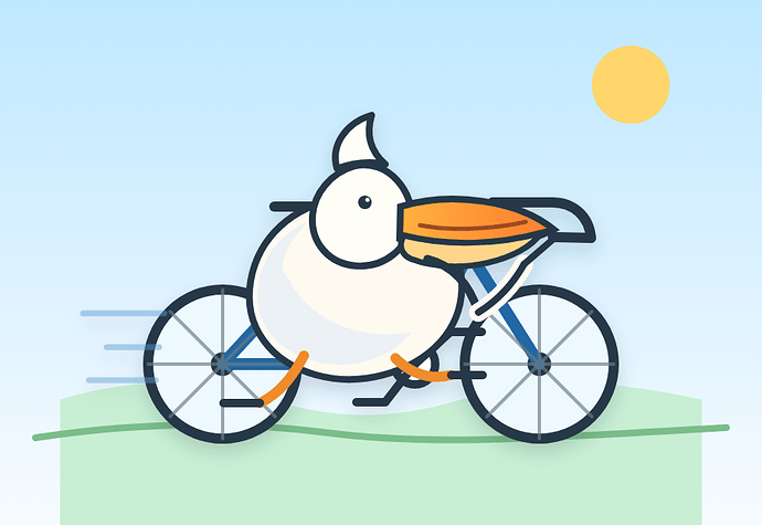
我的是不是降智了。哈哈测试出来96 -
 润之 06-24 21:563楼
M3我觉得不着急让他想,或者多开几个session轮着交互,效果还不错的
-
吴昊 06-24 21:574楼
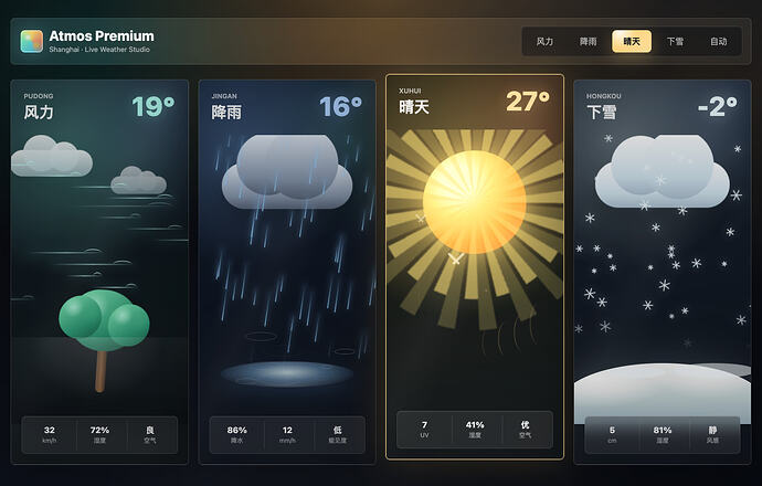
* 帖子来源Linux.do
附近帖子
飞读
jantrid
|
主题数 1 |
帖子数 1 |
注册排名 3 |
随机推荐
- 毕业生的一年多经历
- GPT pro网页版什么时候开始限额的?和codex共享额度了?
- GPT Plus 订阅代充值 120 元/月,自助充值,可开正规企业发票。
- iOS 26.2 -> 26.7 -> 27?
- KIMI K3等国模渠道已恢复,可以继续蹬了,再送20份小鸡毛注册邀请码~
- 绿云下个月的周年庆活动,有情报吗?想买个iij
- 佬们,现在开发APP 上架IOS和安卓都需要啥压
- GPT 6 Astra 糖果题 看来一直分流 家宽 AI 还是有点用
- 预估了下mimo新套餐的额度。
- codex的Selected model is at capacity. Please try a different model.问题