html
`
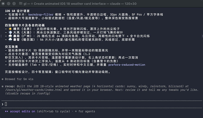
天气 · iOS 18
* { margin: 0; padding: 0; box-sizing: border-box; -webkit-tap-highlight-color: transparent; }
html, body { min-height: 100vh; }
body {
font-family: -apple-system, BlinkMacSystemFont, “SF Pro Display”, “SF Pro Text”,
“PingFang SC”, “Helvetica Neue”, “Microsoft YaHei”, sans-serif;
color: #fff;
display: flex;
flex-direction: column;
overflow-x: hidden;
background: #0e1322;
}
/* ---------- 全局氛围背景(点击卡片交叉淡入) ---------- /
.bg {
position: fixed; inset: 0; z-index: -2;
opacity: 0;
transition: opacity 1.2s ease;
pointer-events: none;
}
.bg.visible { opacity: 1; }
.bg[data-w=“default”] {
background: linear-gradient(165deg, #0f1020 0%, #1c2541 55%, #2a3550 100%);
}
.bg[data-w=“sunny”] {
background:
radial-gradient(1100px 620px at 82% -8%, rgba(255, 187, 92, .50), transparent 62%),
linear-gradient(168deg, #1a3a66 0%, #2c5a9e 52%, #6f9fd4 100%);
}
.bg[data-w=“windy”] {
background:
radial-gradient(900px 500px at 15% 8%, rgba(173, 226, 219, .22), transparent 60%),
linear-gradient(168deg, #14303a 0%, #2b5f63 55%, #4f8a7c 100%);
}
.bg[data-w=“rain”] {
background:
radial-gradient(900px 540px at 75% 0%, rgba(120, 132, 220, .25), transparent 60%),
linear-gradient(168deg, #090f20 0%, #18233f 55%, #2c3a5e 100%);
}
.bg[data-w=“snow”] {
background:
radial-gradient(1000px 560px at 50% -10%, rgba(225, 238, 252, .28), transparent 65%),
linear-gradient(168deg, #1b2940 0%, #38536e 55%, #7795ae 100%);
}
body::after { / 轻微暗角,增强层次 */
content: “”; position: fixed; inset: 0; z-index: -1; pointer-events: none;
background: radial-gradient(120% 90% at 50% 40%, transparent 55%, rgba(0,0,0,.35) 100%);
}
/* ---------- 顶部栏 ---------- */
header {
display: flex; justify-content: space-between; align-items: flex-end;
padding: 38px 52px 6px;
}
header h1 { font-size: 36px; font-weight: 700; letter-spacing: .5px; }
.date { margin-top: 6px; font-size: 15px; color: rgba(255,255,255,.65); }
.clock-wrap { text-align: right; }
.clock { font-size: 32px; font-weight: 200; font-variant-numeric: tabular-nums; letter-spacing: 1px; }
.status {
margin-top: 4px; font-size: 13px; color: rgba(255,255,255,.6);
}
.status.swap { animation: status-in .5s ease; }
@keyframes status-in {
from { opacity: 0; transform: translateY(6px); }
to { opacity: 1; transform: translateY(0); }
}
/* ---------- 横板卡片区 ---------- */
.cards {
flex: 1;
display: flex; align-items: center;
gap: 26px;
padding: 26px 52px 18px;
perspective: 1500px;
overflow-x: auto;
scroll-snap-type: x proximity;
}
.cards::-webkit-scrollbar { display: none; }
.card {
position: relative;
flex: 1;
min-width: 252px;
height: 460px;
border-radius: 32px;
overflow: hidden;
cursor: pointer;
scroll-snap-align: center;
background: rgba(255,255,255,.08);
-webkit-backdrop-filter: blur(30px) saturate(160%);
backdrop-filter: blur(30px) saturate(160%);
border: .5px solid rgba(255,255,255,.22);
box-shadow: 0 22px 55px rgba(0,0,0,.38);
transition: transform .8s cubic-bezier(.22,1,.36,1),
box-shadow .45s ease, opacity .6s ease, filter .6s ease;
animation: enter .9s cubic-bezier(.22,1,.36,1) backwards;
animation-delay: calc(var(–i) * 110ms);
outline: none;
}
@keyframes enter {
from { opacity: 0; transform: translateY(46px) scale(.96); }
to { opacity: 1; transform: translateY(0) scale(1); }
}
.card:focus-visible { box-shadow: 0 0 0 2.5px rgba(255,255,255,.8), 0 22px 55px rgba(0,0,0,.38); }
.card.active {
transform: translateY(-10px) scale(1.04);
box-shadow: 0 0 0 1.5px rgba(255,255,255,.6), 0 32px 75px rgba(0,0,0,.5);
}
.cards.has-active .card:not(.active) {
opacity: .58; filter: saturate(.8) brightness(.9);
}
/* 每张卡的玻璃底色微调 */
.card.sunny { background: linear-gradient(180deg, rgba(255,178,84,.20), rgba(255,255,255,.05) 60%); }
.card.windy { background: linear-gradient(180deg, rgba(150,225,210,.16), rgba(255,255,255,.05) 60%); }
.card.rain { background: linear-gradient(180deg, rgba(86,110,190,.24), rgba(255,255,255,.04) 60%); }
.card.snow { background: linear-gradient(180deg, rgba(214,233,252,.20), rgba(255,255,255,.05) 60%); }
/* 鼠标高光(随光标移动的镜面反射) */
.glare {
position: absolute; inset: 0; z-index: 5; pointer-events: none;
border-radius: inherit;
opacity: 0; transition: opacity .4s ease;
background: radial-gradient(380px circle at var(–mx, 50%) var(–my, 50%),
rgba(255,255,255,.22), transparent 62%);
}
.card:hover .glare { opacity: 1; }
/* ---------- 卡片文字内容 ---------- */
.card-content {
position: relative; z-index: 3;
height: 100%;
padding: 24px 22px 22px;
display: flex; flex-direction: column;
}
.card-top { display: flex; justify-content: space-between; align-items: flex-start; }
.city { font-size: 19px; font-weight: 600; letter-spacing: .3px; }
.cond { margin-top: 3px; font-size: 13px; color: rgba(255,255,255,.72); }
.badge {
font-size: 17px; line-height: 1;
background: rgba(255,255,255,.14);
border: .5px solid rgba(255,255,255,.18);
border-radius: 100px; padding: 7px 9px;
}
.spacer { flex: 1; }
.temp { font-size: 68px; font-weight: 200; line-height: 1; letter-spacing: -2px; }
.temp sup { font-size: 36px; font-weight: 300; vertical-align: 18px; letter-spacing: 0; }
.range { margin-top: 8px; font-size: 13px; color: rgba(255,255,255,.72); }
.metrics {
margin-top: 16px;
display: grid; grid-template-columns: 1fr 1fr 1fr;
gap: 4px;
background: rgba(255,255,255,.10);
border: .5px solid rgba(255,255,255,.14);
border-radius: 18px;
padding: 11px 8px;
}
.metric { text-align: center; }
.metric b { display: block; font-size: 14px; font-weight: 600; }
.metric span {
display: block; margin-top: 3px;
font-size: 10px; letter-spacing: .6px;
color: rgba(255,255,255,.55);
}
/* ---------- 动画舞台 ---------- */
.scene {
position: absolute; inset: 0; z-index: 1;
border-radius: inherit; overflow: hidden;
-webkit-mask-image: linear-gradient(to bottom, transparent 0, #000 26px);
mask-image: linear-gradient(to bottom, transparent 0, #000 26px);
pointer-events: none;
}
/* ===== 晴天 ===== /
.sun {
position: absolute; top: 58px; left: 50%;
width: 92px; height: 92px; margin-left: -46px;
border-radius: 50%;
background: radial-gradient(circle at 35% 35%, #fff6d8, #ffd76e 45%, #ffae34 78%);
animation: sun-pulse 4.5s ease-in-out infinite;
}
@keyframes sun-pulse {
0%, 100% { box-shadow: 0 0 55px 18px rgba(255,190,80,.50); transform: scale(1); }
50% { box-shadow: 0 0 90px 32px rgba(255,190,80,.72); transform: scale(1.05); }
}
.sun-rays {
position: absolute; top: 104px; left: 50%;
width: 0; height: 0;
animation: spin 26s linear infinite;
}
@keyframes spin { to { transform: rotate(360deg); } }
.sun-rays i {
position: absolute; left: -2.5px; top: -16px;
width: 5px; height: 32px; border-radius: 3px;
background: linear-gradient(to top, rgba(255,205,100,0), rgba(255,218,128,.95));
animation: ray-flick 2.6s ease-in-out infinite;
}
@keyframes ray-flick {
0%, 100% { opacity: .55; } 50% { opacity: 1; }
}
.sun-rays i:nth-child(1) { transform: rotate(0deg) translateY(-88px); }
.sun-rays i:nth-child(2) { transform: rotate(45deg) translateY(-88px); animation-delay: .3s; }
.sun-rays i:nth-child(3) { transform: rotate(90deg) translateY(-88px); animation-delay: .6s; }
.sun-rays i:nth-child(4) { transform: rotate(135deg) translateY(-88px); animation-delay: .9s; }
.sun-rays i:nth-child(5) { transform: rotate(180deg) translateY(-88px); animation-delay: 1.2s; }
.sun-rays i:nth-child(6) { transform: rotate(225deg) translateY(-88px); animation-delay: 1.5s; }
.sun-rays i:nth-child(7) { transform: rotate(270deg) translateY(-88px); animation-delay: 1.8s; }
.sun-rays i:nth-child(8) { transform: rotate(315deg) translateY(-88px); animation-delay: 2.1s; }
.mote { / 漂浮的光尘 */
position: absolute;
border-radius: 50%;
background: rgba(255, 226, 160, .9);
filter: blur(.5px);
animation: mote linear infinite;
}
@keyframes mote {
0% { transform: translateY(30px); opacity: 0; }
25% { opacity: .85; }
100% { transform: translateY(-160px); opacity: 0; }
}
/* ===== 云(大风 / 暴雨 / 暴雪共用基础形状) ===== */
.cloud {
position: absolute;
width: 96px; height: 32px; border-radius: 32px;
background: rgba(255,255,255,.85);
}
.cloud::before, .cloud::after {
content: “”; position: absolute; border-radius: 50%;
background: inherit;
}
.cloud::before { width: 44px; height: 44px; left: 13px; top: -21px; }
.cloud::after { width: 30px; height: 30px; right: 15px; top: -12px; }
/* ===== 大风 ===== */
.windy .cloud.c1 { top: 86px; left: -120px; animation: drift 13s linear infinite; }
.windy .cloud.c2 {
top: 142px; left: -120px; opacity: .65; transform: scale(.62);
animation: drift 8.5s linear infinite; animation-delay: -4s;
}
@keyframes drift {
from { translate: 0 0; } to { translate: 560px 0; }
}
.gust {
position: absolute; left: -160px;
width: 130px; height: 3.5px; border-radius: 4px;
background: linear-gradient(90deg, transparent, rgba(255,255,255,.9), rgba(255,255,255,0));
animation: gust 2.4s ease-in infinite;
}
@keyframes gust {
0% { transform: translateX(0); opacity: 0; }
18% { opacity: .95; }
80% { opacity: .9; }
100% { transform: translateX(620px); opacity: 0; }
}
.windy .gust.g1 { top: 70px; }
.windy .gust.g2 { top: 122px; animation-delay: .8s; animation-duration: 2s; }
.windy .gust.g3 { top: 176px; animation-delay: 1.5s; width: 90px; }
.leaf {
position: absolute; top: 120px; left: -36px;
font-size: 17px;
animation: leaf 4.2s ease-in infinite;
}
@keyframes leaf {
0% { transform: translate(0, 0) rotate(0deg); opacity: 0; }
12% { opacity: 1; }
60% { transform: translate(300px, 52px) rotate(420deg); opacity: 1; }
100% { transform: translate(540px, 22px) rotate(760deg); opacity: 0; }
}
/* ===== 暴雨 ===== */
.storm-cloud {
position: absolute; top: -34px; left: -8%;
width: 116%; height: 120px;
background: radial-gradient(62% 86% at 50% 24%,
rgba(72, 84, 112, .96), rgba(42, 50, 74, .65) 62%, transparent 100%);
filter: blur(2px);
animation: cloud-bob 6s ease-in-out infinite;
}
.storm-cloud.back {
top: -20px; left: 20%; width: 90%; height: 90px;
opacity: .7; animation-delay: -3s;
}
@keyframes cloud-bob {
0%, 100% { transform: translateY(0); } 50% { transform: translateY(6px); }
}
.storm-cloud.snowy {
background: radial-gradient(62% 86% at 50% 24%,
rgba(212, 222, 236, .8), rgba(160, 176, 198, .45) 62%, transparent 100%);
}
.drop {
position: absolute; top: -26px;
width: 2px;
border-radius: 2px;
background: linear-gradient(to bottom, rgba(173,216,255,0), rgba(173,216,255,.85));
animation: drop-fall linear infinite;
}
@keyframes drop-fall {
from { transform: translate3d(0, 0, 0) rotate(12deg); }
to { transform: translate3d(-120px, 560px, 0) rotate(12deg); }
}
.flash {
position: absolute; inset: 0; z-index: 2;
background: radial-gradient(80% 60% at 50% 18%, rgba(255,255,255,.95), rgba(210,220,255,.35) 70%);
opacity: 0;
animation: flash 7s linear infinite;
}
@keyframes flash {
0%, 50.8%, 54.6%, 58.5%, 100% { opacity: 0; }
51.6%, 53.4% { opacity: .85; }
56.5% { opacity: .4; }
}
.bolt {
position: absolute; top: 64px; left: 50%;
width: 58px; height: 96px; margin-left: -29px;
background: linear-gradient(180deg, #fff4cd, #ffd966);
clip-path: polygon(42% 0, 68% 0, 50% 36%, 66% 36%, 30% 100%, 43% 52%, 26% 52%);
filter: drop-shadow(0 0 14px rgba(255, 226, 140, .95));
opacity: 0;
animation: bolt 7s linear infinite;
}
@keyframes bolt {
0%, 51.2%, 53.8%, 100% { opacity: 0; }
51.8%, 53.2% { opacity: 1; }
}
/* ===== 暴雪 ===== */
.flake {
position: absolute; top: -14px;
border-radius: 50%;
background: #fff;
animation: flake-fall linear infinite;
}
@keyframes flake-fall {
from { transform: translate3d(0, 0, 0); }
to { transform: translate3d(var(–drift, -60px), 545px, 0); }
}
.snow .gust { opacity: .6; }
.snow .gust.g1 { top: 150px; animation-delay: .4s; }
.snow .gust.g2 { top: 235px; animation-delay: 1.6s; animation-duration: 1.9s; }
.frost {
position: absolute; left: 0; right: 0; bottom: 0; height: 96px;
background: linear-gradient(to top, rgba(255,255,255,.16), transparent);
}
/* ---------- 底部提示 ---------- */
footer {
text-align: center;
padding: 4px 0 26px;
font-size: 13px; color: rgba(255,255,255,.45);
}
@media (max-width: 720px) {
header { padding: 28px 26px 4px; }
.cards { padding: 22px 26px 14px; }
.clock { font-size: 24px; }
}
@media (prefers-reduced-motion: reduce) {
*, *::before, *::after { animation: none !important; transition: none !important; }
}
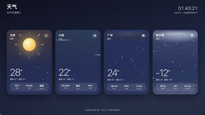
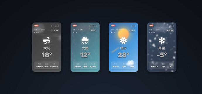
<!-- 晴天 -->

<article class="card sunny" data-weather="sunny" style="--i:0" tabindex="0"

         role="button" aria-pressed="false" aria-label="北京,晴朗,28度">

  <div class="scene">

    <div class="sun-rays"><i></i><i></i><i></i><i></i><i></i><i></i><i></i><i></i></div>

    <div class="sun"></div>

    <div class="mote-layer"></div>

  </div>

  <div class="glare"></div>

  <div class="card-content">

    <div class="card-top">

      <div>

        <div class="city">北京</div>

        <div class="cond">晴朗</div>

      </div>

      <div class="badge">☀️</div>

    </div>

    <div class="spacer"></div>

    <div class="temp"><span class="temp-num" data-temp="28">28</span><sup>°</sup></div>

    <div class="range">最高 32° · 最低 21°</div>

    <div class="metrics">

      <div class="metric"><b>32%</b><span>湿度</span></div>

      <div class="metric"><b>6 km/h</b><span>风速</span></div>

      <div class="metric"><b>很强</b><span>紫外线</span></div>

    </div>

  </div>

</article>


<!-- 大风 -->

<article class="card windy" data-weather="windy" style="--i:1" tabindex="0"

         role="button" aria-pressed="false" aria-label="大连,大风,22度">

  <div class="scene">

    <span class="gust g1"></span>

    <span class="gust g2"></span>

    <span class="gust g3"></span>

    <div class="cloud c1"></div>

    <div class="cloud c2"></div>

    <span class="leaf">🍃</span>

  </div>

  <div class="glare"></div>

  <div class="card-content">

    <div class="card-top">

      <div>

        <div class="city">大连</div>

        <div class="cond">大风</div>

      </div>

      <div class="badge">💨</div>

    </div>

    <div class="spacer"></div>

    <div class="temp"><span class="temp-num" data-temp="22">22</span><sup>°</sup></div>

    <div class="range">最高 24° · 最低 17°</div>

    <div class="metrics">

      <div class="metric"><b>64 km/h</b><span>阵风</span></div>

      <div class="metric"><b>西北</b><span>风向</span></div>

      <div class="metric"><b>45%</b><span>湿度</span></div>

    </div>

  </div>

</article>


<!-- 暴雨 -->

<article class="card rain" data-weather="rain" style="--i:2" tabindex="0"

         role="button" aria-pressed="false" aria-label="广州,暴雨,24度">

  <div class="scene">

    <div class="bolt"></div>

    <div class="storm-cloud back"></div>

    <div class="storm-cloud"></div>

    <div class="rain-layer"></div>

    <div class="flash"></div>

  </div>

  <div class="glare"></div>

  <div class="card-content">

    <div class="card-top">

      <div>

        <div class="city">广州</div>

        <div class="cond">暴雨</div>

      </div>

      <div class="badge">⛈️</div>

    </div>

    <div class="spacer"></div>

    <div class="temp"><span class="temp-num" data-temp="24">24</span><sup>°</sup></div>

    <div class="range">最高 26° · 最低 22°</div>

    <div class="metrics">

      <div class="metric"><b>48 mm</b><span>降水</span></div>

      <div class="metric"><b>93%</b><span>湿度</span></div>

      <div class="metric"><b>1.2 km</b><span>能见度</span></div>

    </div>

  </div>

</article>


<!-- 暴雪 -->

<article class="card snow" data-weather="snow" style="--i:3" tabindex="0"

         role="button" aria-pressed="false" aria-label="哈尔滨,暴雪,零下12度">

  <div class="scene">

    <div class="storm-cloud snowy back"></div>

    <div class="storm-cloud snowy"></div>

    <div class="snow-layer"></div>

    <span class="gust g1"></span>

    <span class="gust g2"></span>

    <div class="frost"></div>

  </div>

  <div class="glare"></div>

  <div class="card-content">

    <div class="card-top">

      <div>

        <div class="city">哈尔滨</div>

        <div class="cond">暴雪</div>

      </div>

      <div class="badge">🌨️</div>

    </div>

    <div class="spacer"></div>

    <div class="temp"><span class="temp-num" data-temp="-12">-12</span><sup>°</sup></div>

    <div class="range">最高 -8° · 最低 -19°</div>

    <div class="metrics">

      <div class="metric"><b>26 cm</b><span>降雪</span></div>

      <div class="metric"><b>-19°</b><span>体感</span></div>

      <div class="metric"><b>0.4 km</b><span>能见度</span></div>

    </div>

  </div>

</article>
移动鼠标查看光影 · 点击卡片切换全局氛围
`


 Madlifer 06-10 01:511楼
 Eevee 06-10 01:544楼
 Takeapocket 06-10 01:556楼
 咖啡泡橘猫 06-10 01:557楼
 Galaxy_Ron 06-10 01:578楼
 胖次糕 06-10 01:589楼
 哈雷彗星 06-10 02:0911楼
 beautifulrem 06-10 02:1012楼
 kevechang 06-10 02:1013楼
 mascot 06-10 02:1314楼
 吃风筝的人 06-10 02:1415楼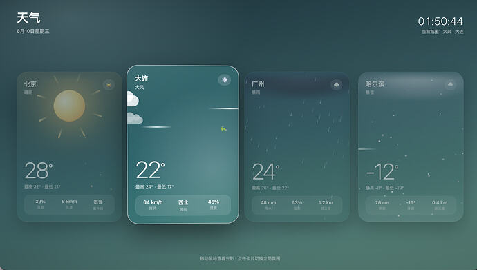
 希望撑得住
希望撑得住