

ui设计skill分享,适用于deepseek。codex救不回来了,没有艺术细胞的东西
声明:我并不是专业前端与ui设计
最近工作项越来越多,有些事情如果不使用工作项记录软件记录下来的话就会忘记,所以我最近打算在本地编写一个简单的 HTML 页面,用来存储每月的工作事项。数据库使用 index.DB 本地存储,我只需要将 HTML 页面以本地方式打开,就能直接操作了。但是使用DeepSeek与 codex生成了几版UI,都不是特别满意,就编写了这个UI设计的skill。
skill参考资料:
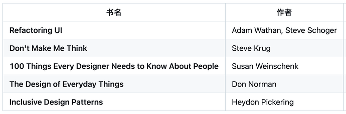
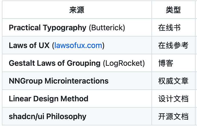
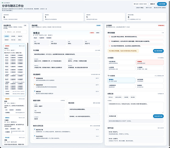
在DeepSeek中测试的效果我还比较满意。但是在codex中,我测试了很多遍,修改了很多版本,它都是放弃不了。它那个逼大圆角,还有那个莫名其妙的配色,主要是暖色系的。整体内容也比较拥挤,而且字体都比较大,怎么调都好像约束不了它。后面我放弃了,如果大家感兴趣也可以自己去codex中测试一下。当然也有可能是我测试的原因,我一般都是直接给一个场景,让它一次性生成一个HTML页面。
ui-design.zip (41.0 KB)
生成的页面都是可交互、响应式的
提示词
一个社区诊所的分诊与随访工作台。前台护士和值班医生会在这里处理当天待接诊患者、紧急插队、检验结果回传、慢病随访提醒以及转诊记录。页面需要同时支持:快速扫描待处理事项、查看单个患者摘要、执行分诊操作、记录处理结果和确认高风险提醒。请你自行决定信息架构、内容文案、交互状态、配色、排版和组件风格。要求做成单文件 HTML,桌面端和移动端都成立,不要截图检查,也不要做成营销页风格。
codex生成效果
index.html.zip (13.8 KB)
deepseek生成效果
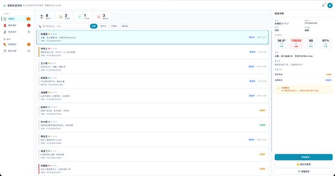
每个人的使用场景可能都不一样。如果你想测试你的场景的话,可以在回复中简单描述一下你的场景。我可以使用DeepSeek帮你测试一下。然后你再考虑是否应该使用这个skill。
-
heidi 楼主 06-07 16:581楼
SKILL正文
name: ui-design
description: Apply UI design best practices when generating HTML, CSS, Tailwind, React, Vue, or any frontend markup. Based on Refactoring UI, Don’t Make Me Think, 100 Things Every Designer Needs to Know, The Design of Everyday Things, and Inclusive Design Patterns. Covers usability principles, visual hierarchy, spacing, typography, color, depth, layout, navigation, components, responsive design, accessibility, microinteractions, and anti-patterns. Use when generating any visual interface.
UI Design Skill
When to Use
When generating or modifying visual UI: HTML/CSS, JSX/TSX, Vue SFCs, Tailwind markup, or any rendered interface.
Do not use for: TypeScript type-safety, framework-level architecture, backend API design, persistence models.
What this skill provides
This skill makes design decisions: what spacing values to use, how large body text should be, which color goes where, whether to add a shadow. It does not prescribe a specific JS framework or CSS library.
The output of this skill is a set of design parameters (numbers, color values, rules). How you encode those parameters depends on your tech stack.
How UI layers fit together
A production UI has three independent layers. Understanding them avoids mixing concerns:
┌──────────────────────────────┐

│ JS Framework                 │

│ (Vue / React / vanilla)      │

├──────────────────────────────┤

│ Component Library            │

│ (Element Plus, Naive UI,     │

│  Ant Design, PrimeVue,       │

│  Vuetify, shadcn/ui,         │

│  Headless UI / Reka UI,      │

│  or none)                    │

├──────────────────────────────┤

│ CSS Approach                 │

│ (Tailwind, CSS variables,    │

│  CSS-in-JS, or a component   │

│  library's built-in theme)   │

└──────────────────────────────┘
- Layer 1 — component logic, state, routing
- Layer 2 — pre-built interactive elements (buttons, tables, modals, forms)
- Layer 3 — how styles are organized (spacing, colors, typography live here)
Layer 1 and Layer 2 are independent choices. Vue works with Element Plus, Ant Design Vue, Naive UI, PrimeVue, or no component library. React works with shadcn/ui, MUI, Headless UI, or none.
Layer 2 and Layer 3 often overlap. A styled component library like Element Plus, Naive UI, or Ant Design bundles its own CSS layer — it ships complete visual designs. You customize its theme variables; you don’t add a separate CSS framework on top.
Headless libraries provide only Layer 2 behavior — keyboard navigation, focus management, ARIA. They have no visual design; you supply Layer 3 yourself (usually Tailwind). Examples: Headless UI (React/Vue), Reka UI (Vue, formerly Radix Vue), TanStack Table.
Some libraries span both categories. PrimeVue offers both styled themes and an “Unstyled Mode” where you keep the complex component logic (DataTable sorting, filtering) but control all visuals with Tailwind. Shadcn Vue gives you copy-paste component code built on Reka UI + Tailwind — you own the source, not a black-box dependency.
How this skill applies to each stack
Your stack
Where the skill’s rules go
Vue + Element Plus / Naive UI
Customize the library’s CSS variables ( --el-color-primary,--n-primary-color, etc.) to match the skill’s color, spacing, and type scales
Vue + Ant Design Vue
Configure Ant Design’s theme system ( token.colorPrimary,token.fontSize)
Vue + PrimeVue (styled theme)
Override PrimeVue’s CSS variables or theme config
Vue + PrimeVue (Unstyled Mode) or Shadcn Vue
Tailwind config carries the values; components inherit them
React + shadcn/ui + Tailwind
Tailwind config carries the values; shadcn/ui components inherit them
Any framework + Tailwind (no component library)
Tailwind config directly maps to Parts 2, 4, 5 scales
Any framework + custom CSS
Define the skill’s scales as CSS custom properties on :root
If your component library already provides styled components (Element Plus, Naive UI, Ant Design, Vuetify, MUI), do not add Tailwind on top. These libraries are both Layer 2 and Layer 3. Adding a second CSS layer will create conflicts. Customize the library’s existing theme system instead. Tailwind makes sense when either (a) you have no component library, or (b) you’re using a headless library or unstyled mode.
Choosing your approach
There is no universally correct choice. The decision depends on your starting point:
If you already have a styled component library in your project:
Stay with it. Replace the library only if its default aesthetic is fundamentally wrong for your product (e.g., Material Design for a luxury brand). Customize its theme variables to match this skill’s design rules. Do not add Tailwind.
If you are starting a new project and want the fastest path to a working UI:
Pick a styled component library. Use its default components as-is, then customize the theme variables to align with Parts 2-5. You get interactive components and visual design in one dependency.
If you need full control over every visual detail (a custom brand, a distinctive product identity):
Use a headless library (Reka UI for Vue, Radix for React) plus Tailwind. The headless library handles keyboard navigation, focus management, and ARIA. Tailwind carries the design values. This is more work but produces a UI that looks like yours, not like a component library.
If you are generating a standalone page or prototype (not a production app):
Use Tailwind directly, without a component library. The skill’s design values go intotailwind.config. This is the fastest path from design rules to a working page — suitable for demos, landing pages, or single-screen tools where you don’t need complex interactive primitives.
Part 0: Design Reasoning Framework
Before applying any rule, answer these four questions. Your answers determine which rule subset applies.
Q1: What is the primary user behavior?
Behavior
Description
Example pages
Read
Absorbing continuous text
Blog, docs, article
Scan
Picking out key information quickly
Landing page, pricing, search results
Operate
Repeatedly performing tasks
Dashboard, dispatch console, admin panel, IDE
Browse
Exploring with no specific goal
E-commerce catalog, portfolio, gallery
Decide
Choosing between clear options
Checkout, settings, signup flow
When a page supports multiple behaviors (e.g., a dashboard that also shows long reports), identify the dominant behavior — the one users spend the most time on.
Q2: What is the engagement duration?
Duration
Typical interface
Design implication
Seconds
Landing page, ad, notification
Must communicate instantly; extreme visual hierarchy
Minutes
Article, checkout, settings form
Comfortable reading; moderate information density
Hours
Dashboard, dispatch console, code editor, spreadsheet
Minimize fatigue; high information density acceptable; dark mode consideration
Q3: What is the information density requirement?
Density
Characteristic
Layout approach
Focused
One thing at a time; each screen has ~1 primary action
Generous spacing, constrained width, prominent CTA
Overview
Need to see many items simultaneously; monitoring/scanning
Fill available width, compact rows, tabular/grid layouts
Mixed
Need both — overview + drill-down
Progressive disclosure: summary view → detail on demand
Q4: What is the emotional context?
Context
Visual tone
Color approach
Routine
Calm, professional, unobtrusive
Neutral + one accent; moderate contrast
Urgent
High contrast, clear status indicators
Dark bg acceptable; semantic colors prominent for alerts
Exploratory
Engaging, distinctive
More personality; unconventional palettes acceptable
Transactional
Trustworthy, clear, frictionless
Conservative colors; clear affordances; no surprises
How the answers interact
Not every question matters equally for every decision. Use this mapping:
Design decision
Most influenced by
Layout width / constraints
Q1 (behavior) + Q3 (density)
Spacing scale
Q2 (duration) + Q3 (density)
Typography scale & weight
Q1 (behavior) + Q2 (duration)
Color intensity & dark/light
Q4 (emotional context) + Q2 (duration)
Component density (padding, etc.)
Q3 (density)
Shadow / depth usage
Q1 (behavior)
Personality (radius, font, tone)
Q4 (emotional context)
Example application
Scheduling a task: Generate a landing page → Read (behavior=read, density=focused) → constrained width, generous spacing, large type, one prominent CTA.
Scheduling a task: Generate a dispatch console → Operate (behavior=operate, density=overview, duration=hours, context=urgent) → fill available width, compact spacing, dark background acceptable, dense information, semantic colors for alerts.
Part 1: Universal Principles
These apply regardless of the answers to Part 0. They are invariant.
1.1 Don’t Make Me Think
Make pages self-evident. If something is not self-evident, make it self-explanatory. Every question mark the user asks adds cognitive workload.
1.2 Users scan, satisfice, and get by
- Users don’t read — they scan for keywords and move on.
- Users don’t weigh options — they click the first reasonable thing.
- Users don’t figure things out — they guess, then use Back if wrong.
This means: hierarchy must work at a glance, the first reasonable option must be the right one, and the Back button must always work.
1.3 Recognition over recall
Menus beat command lines. Labeled buttons beat memorized shortcuts. Information in the world beats information in the head.
1.4 Proximity = grouping
Elements close together are perceived as a group. Rule: more space around a group than within it. Form labels closer to inputs than to the next group. Card sections separated by more padding than internal content.
1.5 Target size (Fitts’s Law)
Interactive targets minimum 44×44px on touch devices. Related actions adjacent.
1.6 Choice reduction (Hick’s Law)
Navigation ≤ 7 top-level items. Complex forms broken into steps. 3-6 curated options with a “see all” fallback.
1.7 Billboard test
At a glance (simulated by squinting), the page must communicate: what is this, what can I do here, and what’s most important?
1.8 Visual design = trust
Users judge credibility by visual design before content. Professional appearance is functional, not cosmetic.
1.9 Defer to content
UI elements (borders, icons, labels, button styles) should visually recede — letting the user’s attention land on content (photos, data, illustrations, headlines) rather than the interface wrapping around it. This is the principle behind Apple’s Human Interface Guidelines: “defer to content.”
Practically:
- Icons should be lighter (lower opacity or lighter gray) than the text they accompany
- Borders should be the lightest gray that still provides structure (gray-100 to gray-200)
- Button backgrounds, when present, should be the primary accent — not multiple saturated colors competing with content
- The most saturated color on the page should be in content (photos, illustrations, data highlights), not in UI chrome
Rationale: When every UI element has equal visual weight, nothing is the hero. The interface should be the frame, not the painting.
For the cognitive psychology research behind these principles (Gestalt laws, attention, memory, decision making), see
references/cognitive-psychology.md.
Part 2: Layout Decisions
Start from Part 0 answers: Q1 (behavior) + Q3 (density).
2.1 When to fill the screen, when to constrain
Behavior = operate or browse  +  Density = overview

→ Fill available width. Do NOT apply max-width to the root container.

→ Use grid or fixed-width sidebars for structure; let content panels flex.

→ Examples: dashboards, dispatch consoles, data tables, file managers.


Behavior = read or decide  +  Density = focused

→ Constrain content width. Apply max-width to text/content areas.

→ Use max-w-prose (65ch) for body text. Use max-w-2xl to max-w-7xl for mixed content.

→ Examples: blog posts, documentation, landing pages, forms.


Behavior = mixed (scan + read)

→ Full-width sections for scan areas (hero, feature grids).

→ Constrained-width for read areas (body copy, testimonials).

→ max-w-7xl with responsive padding is a safe default.
2.2 Spacing scales
Derive spacing from Q2 (engagement) + Q3 (density):
Density = overview / Duration = hours (dashboards, tools):

  4, 8, 12, 16, 20, 24, 32, 40, 48

  Tailwind: p-1(4) p-2(8) p-3(12) p-4(16) p-5(20) p-6(24) p-8(32)


Density = mixed / Duration = minutes (admin, settings):

  8, 12, 16, 24, 32, 48, 64, 80, 96

  Tailwind: p-2(8) p-3(12) p-4(16) p-6(24) p-8(32) p-12(48)


Density = focused / Duration = seconds-minutes (landing, marketing):

  12, 16, 24, 32, 48, 64, 96, 128, 160

  Tailwind: p-3(12) p-4(16) p-6(24) p-8(32) p-12(48) p-16(64) p-24(96)
Adjacent values must differ by ≥25% for the difference to be perceptible.
2.3 Within-group vs between-group spacing
Rule: more space around a group than within it. This is invariant — it applies at all densities.
Context
Within group
Between groups
Form label → input
4-8px (mb-1 to mb-2)
16-24px (mb-4 to mb-6)
Card internal padding
12-16px (p-3 to p-4)
16-24px gap between cards
Heading → its content
4-8px
16-24px before next heading
List items
4-8px gap
16+px before/after list
2.4 Grid vs flex vs fixed width
Situation
Use
Reason
Equal card grid
gridwith responsive cols
Items should scale within the grid
Sidebar + content
flexwith fixed sidebar width
Sidebar width should not change with viewport
Form
Constrained width (max-w-lg to max-w-xl)
Forms shouldn’t stretch beyond readability
Text content
max-w-prose (65ch)
Line length for reading comfort
Dashboard panels
Grid or flex, fill width
Panels should use available space
50/50 split (text + image)
grid grid-cols-2
Both halves scale proportionally
2.5 Don’t fill the screen — when this rule applies
This rule applies to reading content, not to operating interfaces. If the user’s task is to read continuous text, constrain it. If the user’s task is to monitor, compare, or manage multiple items simultaneously, fill the screen.
For page archetypes with concrete HTML templates, see
references/layout-patterns.md.
Part 3: Typography Decisions
Start from: Q1 (behavior) + Q2 (duration).
3.1 Type scale selection
Density = overview / Behavior = operate (tools, dashboards):

  Body: 13-14px  Caption: 11-12px  Heading: 16-20-24px

  Line height: 1.35-1.5 for body, 1.2-1.3 for headings


Density = mixed (admin, settings, most apps):

  Body: 14-16px  Caption: 12-13px  Heading: 18-24-30-36px

  Line height: 1.5 for body, 1.25-1.3 for headings


Density = focused / Behavior = read (articles, docs):

  Body: 16px+  Heading: 20-24-30-36-48px

  Line height: 1.6-1.75 for body, 1.1-1.25 for headings
3.2 Line length
Behavior = read → 45-75 characters (max-w-prose, ~65ch)

Behavior = scan → 50-90 characters acceptable

Behavior = operate → No hard limit; content can fill panel width
Wider text requires taller line height. At 75 chars, use ~1.6; at 45 chars, 1.4 is adequate.
3.3 Font selection
Body text: system font stack (Tailwind
font-sans). Fastest, most readable, zero download. Always the safe default.
Headings: one web font for brand personality, if needed. Filter for 5+ weights; avoid condensed x-heights for body.
Behavior = operate (tools): system font stack only. Web fonts add no functional value to tools.
Font weights: two weights are enough for most interfaces (400-500 normal, 600-700 emphasis). Never use weights under 400 in UI.
3.4 Alignment
- Body text: left-aligned (or start-aligned for RTL)
- Short headlines (≤2 lines): center-align OK
- Numbers in tables: right-align so decimals line up
- Mixed font sizes on one line: align by baseline (
items-baseline), not center
3.5 Letter-spacing
Context
Value
Tailwind
Headings
-0.01em to -0.02em
tracking-tight
Body
0 (default)
—
All-caps
+0.05em
tracking-widerortracking-widest
3.6 Links
In navigation and link-heavy areas: use weight or color difference, not colored text for every link. Ancillary links: show color/underline only on hover.
For font pairing strategies and detailed type scale tables, see
references/typography.md.
Part 4: Color Decisions
Start from: Q4 (emotional context) + Q2 (duration).
4.1 Dark vs light background
Duration = hours + behavior = operate → Consider dark mode

  Dark backgrounds reduce eye fatigue during prolonged use.

  Pure black (#000) is too harsh — use near-black with slight hue (e.g., slate-900).


Duration = minutes + behavior = read → Light background

  Light backgrounds provide better readability for continuous text.

  White (#fff) on pure white feels sterile — use slightly warm/cool off-white.


Default for unknown context: Light. Dark only when duration or context justifies it.


When dark mode is indicated, see `references/color-systems.md` for dark mode palette construction — dark backgrounds require different saturation and contrast handling than light ones.
4.2 Color intensity by context
Context = urgent:

  Semantic colors (red, amber, green) should be prominent — they carry operational meaning.

  Dark backgrounds acceptable.

  Higher overall contrast.


Context = routine:

  One primary accent + neutrals. Semantic colors used sparingly.

  Light backgrounds preferred.

  Moderate contrast — readable but not aggressive.


Context = exploratory:

  More personality allowed. Slightly unconventional palettes OK.

  Still maintain one primary + neutrals + semantics structure.


Context = transactional:

  Conservative palette. No visual surprises.

  Trust signals: clean, professional, clear affordances.
4.3 Building a palette (when not using an existing design system)
Scale: 1 primary × 9 shades + 1 gray × 9 + 4 semantics × 5 each ≈ 38 total.
Step 1: Pick shade 500 (for buttons).
Step 2: Pick shade 900 (darkest text) and 100 (lightest tint).
Step 3: Fill 700 (compromise between 500 and 900), 300 (compromise between 500 and 100).
Step 4: Fill remaining gaps.
Saturation compensation: as lightness moves away from 50%, increase saturation to keep colors vibrant.
Grays: pure grays (0% saturation) feel sterile. Use slight hue:
hsl(220, 10%, X)for cool,hsl(40, 8%, X)for warm.
For WCAG contrast ratio requirements and dark mode palette construction, see
references/color-systems.md.
4.4 Common color mistakes (and why they fail)
- Gray text on colored backgrounds → looks faded. Opacity reduction dilutes both lightness and chroma (color intensity) in a way pure HSL doesn’t. Use a hand-picked hue-matched lighter color instead.
- Color as the only differentiator → 9% of men are color-blind. Always add an icon, text label, or pattern.
- More than one accent hue (excluding semantics) → visual chaos. The brain can only track one “this means action” color.
- Saturated colors on large areas → visually exhausting. Use desaturated tints for backgrounds.
4.5 60-30-10 rule (interpreted correctly)
60% Neutral backgrounds — page, cards, sections

30% Neutral elements — text, borders, icons

10% Accent — buttons, links, key highlights (this includes all semantic colors combined)
This is a guideline, not a strict formula. For tools with many status indicators, the 10% may be closer to 15-20%.
Text color levels: Within the 30% neutral elements, text should follow a clear 3-level color scale — matching the intent of Apple’s
label,secondaryLabel,tertiaryLabelsystem — not arbitrary gray values:
Level
Purpose
Example color (light bg)
Primary
Body text, headings, key data
near-black (gray-900)
Secondary
Subtitles, captions, metadata
medium gray (gray-500)
Tertiary
Placeholders, disabled text, watermarks
light gray (gray-400)
Each level should be perceptibly different from its neighbor. Don’t use two nearly-identical grays for different purposes — users won’t perceive the difference as meaningful.
4.6 Accent color placement
Accent colors (the primary brand hue) should appear in content and actions, not in the interface frame.
Place accent colors here
Keep accent colors out of
Buttons (primary CTA)
Section borders
Links and active nav items
Dividers / separator lines
Selected/active states
Panel backgrounds
Brand illustrations and icons
Decorative UI trim
Progress indicators
Table header backgrounds
Why: When accent color spreads into the interface frame (borders, dividers, backgrounds), the user loses the signal “this color = something I can act on.” Accent becomes decoration, and discoverability of interactive elements drops.
Gray rule: All structural elements — borders, dividers, section backgrounds, panel frames — should use neutral grays only (gray-100 to gray-300). Reserve the accent channel for meaning.
Part 5: Depth & Elevation Decisions
Start from: Q1 (behavior).
5.1 When shadows help
Behavior = browse, decide, or scan → Shadows help

  Cards, modals, dropdowns benefit from elevation cues.

  Use 3-5 elevation levels.


Behavior = operate (dense tools) → Shadows can distract

  Use sparingly. Content hierarchy from size/color/position is usually enough.

  Elevated elements (modals, dropdowns) still need shadows.
5.2 Elevation levels (when used)
Level
Shadow
Use
0
None
Flat content areas
1
shadow-sm
Cards, elevated panels
2
shadow
Dropdowns
3
shadow-md
Sticky headers/nav
4
shadow-lg
Modals
5
shadow-xl
Overlays
5.3 Light direction
Light comes from above. Raised elements: lighter top edge, shadow below. Inset elements: darker top, highlight below.
5.4 Alternatives to borders
When separating elements in dense interfaces, borders create visual noise. Alternatives in order of preference:
- Background color alternation (white → gray-50 → white)
- Extra spacing (gap between groups visibly larger than gap within)
- Box shadow (for elevated cards)
- Borders (last resort, for dense data tables)
Reference: High-quality sites routinely achieve section distinction with zero visible borders — generous vertical padding alone (
py-16topy-24) provides enough spatial separation that no line is needed. Before adding any border, ask: “would more space or a background shift do the same job?” When borders are necessary, use the lightest available gray (gray-100 to gray-200) — never the accent color.
5.5 Shadow minimalism
Start with no shadow. Add elevation cues only when an element genuinely needs to sit above the surface (modals, dropdowns, sticky headers). When shadows are needed, use the lightest perceptible shadow — just enough to suggest elevation without adding visual weight.
Context
Shadow approach
Example
Cards on white bg
0 1px 2px rgba(0,0,0,0.04)or background difference alone
Apple Store product cards
Elevated panel
0 1px 3px rgba(0,0,0,0.06)
Sidebar, detail panel
Dropdown
0 2px 8px rgba(0,0,0,0.08)
Menu, select
Modal
0 8px 24px rgba(0,0,0,0.12)
Dialog overlay
Principle: If the shadow is noticeable at a glance, it’s too heavy. Shadows should be felt, not seen. A well-lit interface with clear spacing and background alternation needs fewer shadows than most designers assume.
Part 6: Component Execution
Component patterns are parameterized by density. The same component type has different execution at different densities.
6.1 Buttons
Density
Padding (md size)
Variants needed
High (tools)
px-4 py-1.5 to px-5 py-2
2-3 (primary, secondary, danger)
Medium
px-6 py-2.5
3-4 (add tertiary link-style)
Low (marketing)
px-8 py-3.5
3-4, larger sizes
Button padding is NOT proportional to font size. Large buttons get disproportionately more padding; small buttons get less.
Placement rules:
- Forms: primary right, secondary/cancel left
- Modals: cancel left, confirm right
- Cards: primary first, secondary below
- Toolbars: most frequent action leftmost
6.2 Input fields
<!-- High density -->

<input class="px-2.5 py-1.5 text-xs rounded" />


<!-- Medium density (default for most apps) -->

<input class="px-3.5 py-2.5 text-sm rounded-lg" />


<!-- Low density -->

<input class="px-4 py-3 text-base rounded-lg" />
Rule (invariant): Label above input, never placeholder-only. Label closer to its input than to the next form group.
6.3 Cards
Invariant: card = visible grouping boundary. Use border, shadow, or background difference.
Density variants:
High density:  p-3 to p-4, gap-3 between cards, subtle border

Medium density: p-5 to p-6, gap-4, border + shadow-sm

Low density: p-6 to p-8, gap-6, shadow-sm to shadow, rounded-xl
6.4 Modals
Invariant structure: overlay (fixed, inset-0, bg-black/50, backdrop-blur-sm) + centered panel (max-w-md, rounded-2xl, shadow-xl).
6.5 Empty states
Every empty state needs: illustration/icon + heading + description + CTA. Hide supporting UI elements that do nothing until content exists. Empty states are first impressions — they carry disproportionate weight (Peak-End Rule).
6.6 Tables
For dense data (behavior=operate):
- Striped rows or subtle horizontal dividers
- Compact: px-3 py-2, text-xs to text-sm
- Right-align numeric columns
For readable data (behavior=scan):
- Row hover state
- Generous: px-4 py-3, text-sm
- Clear header/body distinction
6.7 More component patterns
See
references/component-patterns.mdfor tabs, pagination, badges, alerts, tooltips, dropdowns, progress indicators, toast notifications, and accordions.
6.8 Empty states in depth
See
references/anti-patterns.md→ “No empty state” for the root cause analysis of why blank screens fail the Peak-End Rule.
Part 7: Diagnostic Passes
Run these 6 passes before finalizing. Each checks one theme — scan for problems, don’t memorize individual questions.
Pass 1: Hierarchy
- Squint test: Can you identify the most important element, navigation, and main content area at a glance? If everything has equal visual weight, hierarchy is flat.
- Text on images: Every text placed on an image or gradient needs a semi-transparent overlay (
bg-black/30tobg-black/50). - Text walls: Any section longer than 4-5 consecutive lines of text without a visual breakpoint (image, icon, stat, illustration) needs an anchor.
- Weight contrast: The most important and least important elements on the page must differ by at least two of: size, weight, color. One dimension alone is not enough.
Pass 2: Grouping & Separation
- Spacing ambiguity: Pick any two adjacent elements. Could they belong to the same group or different groups? If you can’t answer instantly, fix the gap ratio — make between-group gaps visibly larger (≥ 2×) than within-group gaps.
- Border audit: Count every visible border. For each: could spacing or background alternation replace it? Keep only structurally necessary borders (table cells, input fields, active states). Section and card borders should use the lightest available gray (gray-100 to gray-200), never the accent color.
Pass 3: Color
- Accent count: ≤ 1 primary accent hue (semantic colors — green, red, amber, blue — are separate channels and don’t count).
- Gray on color: No gray text on colored backgrounds. Replace with a hand-picked, hue-matched lighter/darker color.
- Accent placement: Accent colors only in actions (buttons, links, selection) and content (illustrations). Never in the interface frame — borders, dividers, panel backgrounds, section separators all use neutrals.
If any of these checks fail, see
references/color-systems.mdfor contrast ratio formulas andreferences/anti-patterns.mdfor the root cause of common color mistakes.
Pass 4: State Coverage
- Loading: Every interactive element that triggers an async action (submit, click) needs a loading state — spinner, skeleton, or disabled state within 400ms.
- Empty: Every list, table, or content area that CAN be empty needs an empty state — icon/illustration + heading + guidance + action.
- Disabled: Every disabled control must visually communicate its state (reduced opacity, no hover effect,
cursor: not-allowed).
Pass 5: Accessibility
- Focus: Tab through every interactive element. The focus ring must be visible at every stop.
focus:outline-nonewithout a replacement is a failure. - Reduced motion: All animations and transitions must respect
prefers-reduced-motion. - Color independence: If the page were rendered in grayscale, would any meaning be lost? Always pair color with an icon, text, or pattern.
Pass 6: Consistency
- Shape language: Buttons (rounded-full) should be visually distinct from content containers (rounded-lg/card) by shape alone.
- Weight economy: ≤ 2 font-weight values on the page. Remove intermediate weights (500, 600).
- Corner coherence: ≤ 3 distinct border-radius values across the entire interface. Pick one radius for large containers, one for interactive elements, apply consistently.
Part 8: Final Review
Answer the Part 0 questions first, then run this. Items marked with
[?]depend on your Part 0 answers.
[ ] Hierarchy clear — squint test passes

[ ] Groups unambiguous — spacing separates groups clearly

[?] Width constraint appropriate for behavior/density

[ ] ≤ 1 primary accent color (semantics are separate)

[ ] No gray text on colored backgrounds

[ ] Accent colors only in actions/content, never in the interface frame

[ ] Text on images has a contrast overlay

[ ] Empty states present for all empty containers

[ ] Loading states present for all async actions

[ ] Focus visible on all interactive elements

[ ] Shape distinguishes interactive from static elements

[ ] ≤ 2 font weights used
Part 9: Design Tokens Quick Reference
Start from the density profile determined in Part 0, then select the appropriate column.
Token
High Density (tools)
Medium Density (apps)
Low Density (marketing)
Body text
13-14px
14-16px
16px+
Caption
11-12px
12-13px
13-14px
H1
20-24px
24-36px
36-60px
H2
18-20px
20-30px
30-48px
H3
16-18px
18-24px
24-36px
Card padding
p-3 to p-4
p-5 to p-6
p-6 to p-8
Section padding y
py-8 to py-12
py-12 to py-16
py-16 to py-24
Button md padding
px-4 py-1.5
px-6 py-2.5
px-8 py-3.5
Input padding
px-2.5 py-1.5
px-3.5 py-2.5
px-4 py-3
Card radius
rounded or rounded-lg
rounded-lg or rounded-xl
rounded-xl or rounded-2xl
Grid gap
gap-3 to gap-4
gap-4 to gap-6
gap-6 to gap-8
Container
Fill width or max-w-7xl
max-w-5xl to max-w-7xl
max-w-2xl to max-w-7xl
References
References fall into two categories with different loading timing:
Design foundations — read before starting design work
These contain the knowledge you need to make informed design decisions. Read all four before applying Parts 2-5. Without them, you’re making choices without understanding the underlying mechanics.
File
What it teaches
references/cognitive-psychology.md
Why design principles work — Gestalt laws, attention, memory, decision making, perception
references/color-systems.md
How color works — HSL model, palette construction, contrast ratios, dark mode adaptation
references/typography.md
How type works — font pairing, type scales, responsive sizing, legibility rules
references/layout-patterns.md
What structures exist — page archetypes, grid systems, section patterns, when to use each
Implementation references — read when the need arises
These contain execution-level detail. Read them when you reach the implementation stage or when a diagnostic finds a problem.
Trigger
Read
Need HTML/CSS for a specific component (tabs, modal, dropdown, toast, accordion, pagination, table, empty state)
references/component-patterns.md
A diagnostic pass found a problem and you need the root cause explanation + fix
references/anti-patterns.md
-
 枫 06-07 16:592楼
我个人感觉codex和DeepSeek都不咋好看
-
heidi 楼主 06-07 17:003楼
以下是references内容,内容有点多,只能这样分批发送
anti-patterns
Anti-Patterns: Diagnostics & Fixes
This file pairs each visual problem with a diagnostic question (how would you find this in your own output?) and a root cause (why does this pattern happen?).
Category: Hierarchy
Flat hierarchy
Diagnostic: Squint. Can you identify the most important element? If nothing pulls focus, hierarchy is flat.
Root cause: Relying on one dimension (size only, or color only) to establish hierarchy. The eye needs at least two dimensions of difference between importance levels.
Fix: Layer size + weight + color for primary elements. De-emphasize secondary elements by making them smaller AND lighter AND lower contrast — not just one of the three.
Gray text on colored backgrounds
Diagnostic: Find any text with
text-gray-*ortext-white/*opacity modifier on a non-neutral background. Does it look washed out?
Root cause: Opacity reduction dilutes both lightness and chroma in HSL space. At 70% opacity on blue, the result is less blue AND less readable than a pure, hand-picked lighter blue.
Fix: Use a hue-matched lighter/darker color. On
bg-blue-600, usetext-blue-200instead oftext-white/70.
Labels as crutches
Diagnostic: Count
label: valuepairs on the page. Could the value communicate the meaning on its own?
Root cause: Defaulting to the
key: valuepattern without considering whether the key is actually needed for comprehension.
Fix (priority order):
- Format alone communicates meaning (bold number = quantity, muted text = secondary)
- Combine label and value into one unit (“12 left in stock” beats “Stock: 12”)
- Label as small supporting text above a prominent value
Headings floating between sections
Diagnostic: Look at each heading. Is the space above it roughly equal to the space below?
Root cause: Applying uniform spacing around headings. A heading belongs to the content below it, not above it.
Fix: Heading closer to its own content than to the previous section.
mb-2below heading,mt-8ormb-8before the next.
Category: Spacing
Ambiguous grouping
Diagnostic: Pick two adjacent items. Could they belong to the same group or different groups? If you can’t answer instantly, spacing is ambiguous.
Root cause: Uniform spacing between all elements. When every gap is the same, the brain gets no grouping signal from proximity.
Fix: Make between-group spacing visibly larger than within-group spacing (≥2× difference). Form labels 6px from their inputs, 24px before the next label.
Cramped default
Diagnostic: Do any elements touch or nearly touch? Is there breathing room around cards, buttons, text blocks?
Root cause: Adding “just enough” space. This produces the minimum viable spacing — which looks cramped.
Fix: Start with too much space, then remove until it feels right. Don’t add space until it stops looking broken.
Sidebar scaling with viewport
Diagnostic: Open the page on a 2560px screen. Is the sidebar disproportionately wide? On a 1024px screen, is it too narrow?
Root cause: Using percentage-based sidebar widths (grid-cols-4 with col-span-1 means 25%).
Fix: Give sidebars a fixed width (
w-64,w-72) and let the main content area flex. The sidebar’s job doesn’t change with screen width.
Exception: For content where both panels contain equal-priority reading material (e.g., email client: folder list + message list), proportional scaling may be appropriate.
Filling the screen unnecessarily
Diagnostic: Does a 600px-wide content block stretch to fill 1400px? Does it look stretched or sparse?
Root cause: Making everything full-width because the navigation or header is full-width.
Fix: Content that has a natural reading width should honor it.
max-w-2xlormax-w-prosefor text content, even if surrounding chrome is full-width.
Counter-rule: This does NOT apply to dashboards, data tables, or tools where the task is “see many things at once.” See SKILL.md Part 2.
Category: Typography
Body text too small
Diagnostic: Is body text < 16px? Will iOS zoom on form fields when focused?
Root cause: 14px looks fine on a designer’s retina display. On standard displays and for users with less-than-perfect vision, it’s uncomfortable.
Fix: 16px minimum for body text. 13-14px acceptable in dense tool interfaces (dashboards, data tables) where the task is scanning, not reading.
Vertically centered mixed sizes
Diagnostic: Find any flex row with
items-centercontaining text of different font sizes on the same line.
Root cause:
items-centercenters the visual center of each text block, but the baseline (where letters sit) is what matters for readability.
Fix: Use
items-baselinewhen mixing font sizes on the same line.items-centeris for icon + text or image + text combinations.
All-caps without letter-spacing
Diagnostic: Find any
uppercasetext. Is letter-spacing at default (0)?
Root cause: Uppercase letters are designed to sit next to lowercase letters. When all are uppercase, they crowd each other.
Fix: Add
tracking-widerortracking-widestto any uppercase text. The smaller the text, the more spacing it needs.
Using em for font sizes
Diagnostic: Any
font-sizeusingemunits on elements that can nest?
Root cause:
emis relative to the parent element’s font size. Nested elements compound the effect, producing sizes outside any controlled scale.
Fix: Use
remfor font sizes (always relative to root).emis acceptable forletter-spacing,padding, and media queries where relative-to-element scaling is the intent.
Too many font weights
Diagnostic: Count the distinct
font-weightvalues used (>2?). Check for intermediate weights like 500 (medium) and 600 (semi-bold) alongside 400 (regular) and 700 (bold).
Root cause: Designers construct elaborate type scales with 4+ weights believing more granularity equals more control. In practice, users cannot distinguish 500 from 600 at body sizes, and the extra weights create ambiguity about which text is “more important.”
Fix: Limit to 2 weights: regular (400) for body/captions and bold (700) for headings/emphasis. If a third weight is truly needed (e.g., for very large display headings), use it in exactly one context and at one size.
Category: Color
Too many accent colors
Diagnostic: Count distinct hue families used for decorative/functional accents (excluding semantic red/green/yellow and neutrals). >1?
Root cause: Using color for variety rather than meaning. Each accent color creates a new “channel” the brain must track.
Fix: One primary accent. Semantic colors (success/error/warning/info) are separate channels with clear meanings — they don’t count as “extra accents.”
Inconsistent grays
Diagnostic: Sample all gray values in the interface. Are they from a fixed scale or random hex values?
Root cause: Picking grays ad-hoc (
#888here,#999there) instead of from a defined scale.
Fix: Use Tailwind’s gray scale (50-950) or define your own 9-step gray scale. Adjacent values should be perceptibly different.
Color as the only information carrier
Diagnostic: If the page were rendered in grayscale, would any meaning be lost?
Root cause: Using color alone to communicate state (red = error, green = success) without a backup channel.
Fix: Always pair color with an icon, text label, or pattern. “Error” text + red icon, not just a red border.
Accent colors in structural chrome
Diagnostic: Do section borders, dividers, or panel backgrounds use the brand accent color? Is the accent hue visible outside of buttons, links, and content illustrations?
Root cause: Accent colors are visually attractive and designers want to “sprinkle” them throughout the interface. But accent in chrome (borders, dividers, decorative trim) dilutes the signal that “this color = actionable.”
Fix: Move all accent away from structural elements and into content/actions only. Section borders, dividers, and backgrounds should use neutral grays. The accent color should mark things the user can interact with (buttons, links, selection) or brand illustrations — nothing else.
Category: Depth
Flat without intent
Diagnostic: Are all surfaces at the same visual elevation? Do cards, headers, and modals look like they’re on the same plane?
Root cause: Removing depth cues (shadows, borders, background differences) for aesthetic cleanliness, without replacing them with alternatives.
Fix: Use at least one depth technique: shadow, background color alternation, or border. Multiple techniques can be combined (shadow + border for cards, background + shadow for modals).
Shadows without light source
Diagnostic: Does the shadow extend evenly in all directions (box-shadow: 0 0 10px)?
Root cause: Using uniform blur without offset. Real light comes from above; shadows fall below.
Fix: Vertical offset (positive y) for shadows. Two-part shadows (tight + soft) for polished results:
box-shadow: 0 1px 3px rgba(0,0,0,0.1), 0 1px 2px rgba(0,0,0,0.06); /* shadow-sm */
Category: Images
Text on images without overlay
Diagnostic: Find text placed on an image or gradient background. Is there a semi-transparent dark layer between the image and the text?
Root cause: Assuming the image’s colors will provide enough contrast for text. Photos are dynamic — no single text color works across the whole image.
Fix: Add
bg-black/30tobg-black/50overlay between image and text. Higher opacity for busier images.
Scaled-up icons
Diagnostic: Any icon rendered at > 3× its designed size? (e.g., 16px icon at 64px)
Root cause: Using the same icon asset at display sizes far beyond its native resolution. Line weights and details don’t scale proportionally.
Fix: Enclose the icon in a colored shape container (rounded square/circle with background). The icon renders at ~2× inside the container, and the container provides the visual weight.
Category: Borders
Border overload
Diagnostic: Count every visible border line on the page. Could at least half be removed and replaced with spacing or background color?
Root cause: Borders are the default separator because they’re explicit. But they add visual noise proportional to their count.
Fix hierarchy (prefer earlier options):
- Background color alternation (section A white, section B gray-50, section A white)
- Extra spacing (wider gap between groups)
- Box shadow (for elevated elements)
- Border (last resort for dense data or required structure)
User-uploaded images bleeding into background
Diagnostic: Do user images have the same background color as the page? When the image has white edges, does it blend into the page?
Root cause: Transparent or white-edged images disappear into white page backgrounds. Visible borders are too heavy.
Fix: Inner shadow or subtle border:
box-shadow: inset 0 0 0 1px rgba(0,0,0,0.1). This creates a boundary without the visual weight of a border.
Category: Buttons
Proportional padding
Diagnostic: Does the ratio of padding to font size stay constant across button sizes?
Root cause: Using
em-based padding that scales 1:1 with font size. Large buttons feel under-padded; small buttons feel over-padded.
Fix: Disproportionate padding. Large buttons get more padding than their font size suggests; small buttons get less.
Destructive styling everywhere
Diagnostic: Is every “delete” or “cancel” button red with solid background?
Root cause: Mapping “dangerous action” directly to “danger button styling” regardless of the button’s prominence in the layout.
Fix: Match destructive styling to the button’s role in the visual hierarchy:
- Primary destructive action (confirmation dialog) → solid red button
- Secondary destructive action (alongside Edit/Save) → red text, transparent background
- Cancel in a modal → secondary button style (gray border), not red
Category: Structure
All surface, no structure
Diagnostic: Looking at the page, can you instantly identify: navigation, main content, secondary content, actions? Or is everything in a single undifferentiated area?
Root cause: Building a page as one continuous scroll without clearly defined visual zones.
Fix: Use at least two of: distinct background colors, section padding, borders, sticky headers, or sidebars to create clearly defined areas.
No empty state
Diagnostic: What does the user see when there’s no data? A blank area? A broken layout?
Root cause: Designing the “happy path” (content exists) without designing the “first open” or “empty” state.
Fix: Every list, table, feed, and content area needs an empty state: icon/illustration + heading + guidance + action button. The empty state is the first impression — see Peak-End Rule in cognitive-psychology.md.
Text wall without visual anchor
Diagnostic: Find any content section longer than 4-5 consecutive lines of text with no accompanying visual element. Does the section feel like a wall of words?
Root cause: Writing content sections as pure text blocks assumes users will read linearly. In practice, users scan and skip — long unbroken text fails to provide the visual reference points the eye needs to navigate and return to after glancing away.
Fix: Insert a visual anchor for every text-heavy section. Options: an illustration/photo, a large stat figure, a colored icon block, a pull quote with distinct styling. The anchor serves as both a landmark (“I remember where that section was”) and a resting point that makes the adjacent text feel shorter.
Category: Visual Weight
UI overpowering content
Diagnostic: Squint at the page. Do the borders, icons, button styles, and UI chrome draw as much attention as the actual content (photos, data, headlines)? Apple’s HIG principle is “defer to content” — if the frame is as loud as the painting, the UI is over-designed.
Root cause: Applying the same visual intensity (color saturation, opacity, weight) to structural UI elements as to content. When icons are as dark as headlines, when borders are as thick as text strokes, the interface becomes visually flat — everything has equal importance.
Fix: Reduce the visual weight of all UI chrome until content is clearly the hero. Icons lighter than text they accompany. Borders at the minimum perceptible gray. The strongest color on the page belongs to content (photos, illustrations, data), not to the box around it.
Heavy shadows
Diagnostic: Are shadows visible at a glance without actively looking for them? Can you point to a shadow and say “that card is elevated” without studying the edge?
Root cause: Starting from a shadow-heavy default (e.g., Tailwind’s
shadow-mdwhich is already quite visible) and treating shadows as a required decoration for every card and panel.
Fix: Start with no shadow. Add only for elements that genuinely sit above the surface (modals, dropdowns, sticky headers). When shadows are necessary, use the lightest value that still creates perceptible elevation:
0 1px 2px rgba(0,0,0,0.04)for cards, not0 4px 6px rgba(0,0,0,0.1). Shadows should be felt, not seen.
Inconsistent corner radii
Diagnostic: List every
border-radiusvalue used on the page. More than 3 distinct values?
Root cause: Ad-hoc radius choices —
rounded(4px) for buttons,rounded-lg(8px) for inputs,rounded-xl(12px) for cards,rounded-2xl(16px) for modals — creating subconscious inconsistency.
Fix: Define a corner radius family: one value for large containers (cards, modals: 12-16px), one for interactive elements (buttons, inputs: matching the container radius or
rounded-full). Apply consistently. Apple’s pattern: ~16-20px for all containers, pill buttons for interactions.
cognitive-psychology
Cognitive Psychology & UX Research
Detailed research findings backing the design principles in SKILL.md.
Sources: 100 Things Every Designer Needs to Know About People (Weinschenk), The Design of Everyday Things (Norman), Laws of UX, NNGroup.
Gestalt Laws of Grouping
Law of Proximity — elements placed close together are perceived as a group. Form labels closer to their inputs than to other fields; card grids need proper gaps.
Law of Similarity — elements sharing visual characteristics (color, size, shape) are perceived as related. All buttons of the same type must look identical. Grouping power hierarchy: Color > Size > Shape.
Law of Common Region — elements inside a defined boundary are perceived as a group. Cards, panels, and bordered sections create visual grouping without labels.
Law of Closure — the brain fills gaps to perceive complete shapes. Partial boundaries (card shadow, 3-side border) are enough to perceive a group.
Law of Continuity — elements aligned on a line or curve are perceived as connected. Navigation links in a row feel like a unit; vertical rhythm in forms creates flow.
Law of Connectedness — visually connected elements (lines, arrows, shared containers) create the strongest grouping. Stronger than proximity, similarity, or common region.
Quantitative UX Laws
Fitts’s Law: Time to acquire a target = f(distance, size). Buttons ≥44px, related actions adjacent.
Hick’s Law: Decision time increases with choices. Navigation ≤7 items. Break complex forms into steps.
Miller’s Law (updated): Modern research shows ~4 items, not 7±2. Chunk information into groups of 4. Baddeley, Cowan.
Jakob’s Law: Users expect your site to work like others. Logo top-left, cart icon, search magnifying glass, underlined links.
Doherty Threshold: <400ms response. Optimistic UI, skeleton screens, transitions <300ms.
Tesler’s Law: Complexity is irreducible — designers should absorb it so users don’t have to.
Von Restorff Effect: The different one is remembered. Primary CTA visually distinct from all other buttons.
Peak-End Rule: Peak moment + ending determine experience. Empty states and success states disproportionately important.
Aesthetic-Usability Effect: Attractive designs perceived as more usable. Visual quality creates tolerance for minor issues.
Serial Position Effect: First and last items remembered best. Key actions at nav menu endpoints.
Perception & Vision
Peripheral vision gets the gist. People use peripheral vision (not central) to judge page layout before reading. If layout feels wrong peripherally, users judge negatively before reading a word.
Pattern recognition is automatic and unstoppable. The brain forces patterns even where none exist. Users WILL group items by proximity, similarity, and alignment regardless of intent. Design groupings explicitly.
Affordances vs Signifiers (Norman). Affordances = what actions are possible. Signifiers = where the action should take place. A button’s shadow/color/border is the signifier; clickability is the affordance. Both must be present. Flat design that hides affordances increases errors.
Red+blue = chromostereopsis. Red text on blue (or vice versa) appears to vibrate at different depths. Never use these color pairs for text/background.
9% of men are color-blind (red-green deficiency). Never rely on color alone. Always add icon, text, or pattern backup.
Norman’s Design Theory
Discoverability + Understanding. The two most important design characteristics: can users figure out what actions are possible, and can they figure out how?
Gulfs of Execution and Evaluation. Execution Gulf = difficulty of figuring out HOW. Bridge with signifiers and constraints. Evaluation Gulf = difficulty of telling WHAT happened. Bridge with immediate, unambiguous feedback.
Seven Stages of Action: Goal → Plan → Specify → Perform → Perceive → Interpret → Compare. Every interaction follows this. Design problems are failures at specific stages — identify which to fix root cause.
Knowledge in Head vs World. Don’t force memorization. Put information in the world through labels, signifiers, constraints. Users should recognize, not recall.
Four Types of Constraints: Physical (square peg, round hole), Cultural (social conventions), Semantic (meaning of situation), Logical (only one option remains). Use constraints to make correct actions obvious.
Slips vs Mistakes. Slips = correct intention, wrong execution (attention failure). Fix with better signifiers/feedback. Mistakes = wrong intention, correct execution (knowledge failure). Fix with better conceptual models.
Featuritis. Adding features to match competitors makes products unusable. Each feature increases complexity. “Better to be great at a few things than mediocre at many.”
Memory & Cognitive Load
Recognition > Recall. Menus beat command lines. Search with autocomplete beats memorizing paths.
~4 items in working memory (not 7). Chunk information accordingly. Phone numbers: XXX-XXX-XXXX = 3 chunks.
Cognitive load has 3 types: Intrinsic (task difficulty), Extraneous (poor design), Germane (learning). Eliminate extraneous through clear design.
Short-term memory = seconds. Don’t make users hold information across pages.
Information in bite-sized chunks. The brain processes ~40 pieces of information consciously at a time. Progressive disclosure (summary → details on demand) respects this.
Attention
Sustained attention ~10 minutes. After that, degrades unless personally interesting. Break long forms into sections with progress indicators.
Multitasking is task-switching. Each switch costs mental resources. Design for single-task focus.
What grabs attention (priority order): Movement, human faces (looking at viewer), food, sex, danger, stories, loud noises. Use sparingly.
People notice only salient cues. If everything is highlighted, nothing is. Salience = contrast against background.
Change blindness. People miss changes in visual fields when not attending directly. Confirm important state changes with explicit feedback.
Motivation & Behavior
Goal-gradient effect. Effort accelerates near a goal. Progress bars and step indicators increase completion.
Variable rewards > fixed rewards. Dopamine spikes on unpredictability (notifications, likes). Use occasional unpredictable positive feedback.
Intrinsic > extrinsic motivation. Progress, mastery, control beat money/points/badges. Let users see progress and feel competent.
Least effort principle. People do minimum work to achieve goals. Remove steps, pre-fill forms, offer smart defaults.
Habits form with easy trigger-action-reward loops. Onboarding flows should center on a single habit-forming loop.
Fewer competitors = more motivation. Small comparison groups (10-50) increase motivation more than large leaderboards.
Social Behavior
Stories persuade more than data. Brain activity synchronizes between speaker and listener during storytelling. Lead with examples, follow with data.
“Look and feel” = #1 trust indicator. Visual design drives credibility judgments more than content accuracy.
Social validation under uncertainty. Reviews, ratings, popularity indicators. Users look at others when unsure.
Real photos > stock photos. Authentic team photos increase trust; generic stock decreases it.
Dunbar’s number = ~150. Communities function best below 150 before requiring hierarchy.
Decision Making
Most decisions are unconscious (emotional, then rationalized). Design for emotional brain first (appeal, trust, ease), then provide rational justification.
Want more choices than can process → freeze. Show 3-6 curated options. Offer “see all” for those wanting more.
Choice = perceived control. Even meaningless customization (theme color, layout density) increases satisfaction.
Time framing > money framing. “Spend a little time” beats “save a little money.” Frame benefits as time saved.
Physical presence increases perceived value. Large product photos increase willingness to pay. Detailed screenshots for digital products.
Mood affects decisions. Positive mood = faster, more intuitive decisions. Negative mood = more analytical, slower. Onboarding and key flows should feel positive.
color-systems
Color Systems
HSL Over Hex
When working systematically with color, use HSL, not hex. HSL allows adjusting hue, saturation, and lightness independently.
In Tailwind, colors are already defined in HSL. In plain CSS:
--brand: hsl(220, 70%, 50%);

--brand-light: hsl(220, 70%, 90%);
Building a 9-Shade Palette
Step 1: Pick the base color (shade 500)
Choose a shade that works as a button background. Example:
hsl(220, 70%, 50%)— a vibrant blue.
Step 2: Find the edges
- Shade 900 (darkest): for text on light backgrounds. Example:
hsl(220, 70%, 20%) - Shade 100 (lightest): for tinted backgrounds. Example:
hsl(220, 70%, 95%)
Step 3: Fill the gaps
Pick 700 and 300 as perfect compromises between the edges:
900  darkest text

800

700  ← compromise between 900 and 500

600

500  BASE (button background)

400

300  ← compromise between 500 and 100

200

100  lightest tint
Then fill 800, 600, 400, 200 using the same approach.
Don’t Let Lightness Kill Saturation
As lightness moves away from 50%, saturation’s visual impact weakens. Compensate:
Shade 900: hsl(220, 85%, 20%)  ← higher saturation

Shade 500: hsl(220, 70%, 50%)  ← base saturation

Shade 100: hsl(220, 80%, 95%)  ← higher saturation than you'd think
Perceived Brightness
Different hues have different perceived brightness at the same lightness:
Brightest (lightest-looking):  Yellow (60°), Cyan (180°), Magenta (300°)

Darkest (darkest-looking):     Red (0°), Green (120°), Blue (240°)
To lighten without washing out: rotate hue toward the nearest bright hue (≤30°).
To darken without going muddy: rotate hue toward the nearest dark hue (≤30°).
Example: yellow palette — rotate darker shades toward orange (30-40°) to keep them warm and rich instead of dull brown.
Grays With Temperature
Pure grays (0% saturation) feel sterile. Add subtle saturation:
Cool gray:  hsl(220, 10%, X%)  — blue-leaning

Warm gray:  hsl(40, 8%, X%)    — yellow/orange-leaning
Increase saturation for lighter and darker shades to maintain consistent temperature.
60-30-10 Rule (Operationalized)
60% Neutral backgrounds — page bg, card bg, section bg

30% Neutral elements     — text, borders, icons

10% Primary accent       — buttons, links, key highlights
Color Don’ts
- ^-^
#000on#fff— usegray-900on white - ^-^ More than 1 accent hue (excluding semantics)
- ^-^ Gray text on colored backgrounds — hand-pick hue-matched colors
- ^-^ Color as the only differentiator — always add an icon or text
- ^-^
text-gray-400for content text — fails WCAG AA on white - ^-^ Saturated colors for large background areas — use desaturated tints
WCAG AA Quick Reference
Text ↓ / BG →
white
gray-50
gray-900
gray-400

gray-500
^-^ (≥18px only)

gray-600
gray-700
gray-800
gray-900
Dark Mode Palette
Page:      gray-950 or gray-900

Card:      gray-800

Body text: gray-200

Heading:   white

Muted:     gray-400

Border:    gray-700

Accent:    reduce saturation by ~10% (e.g., brand-400 instead of brand-500)

Shadows:   shadow-gray-950/50 (nearly invisible)
-
heidi 楼主 06-07 17:244楼
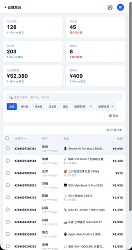
页面都是可交互,响应式的
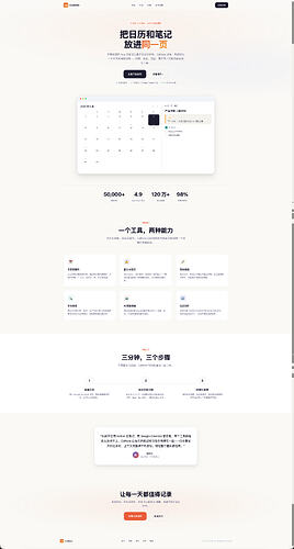
设计一个日历和笔记混合产品的营销网站
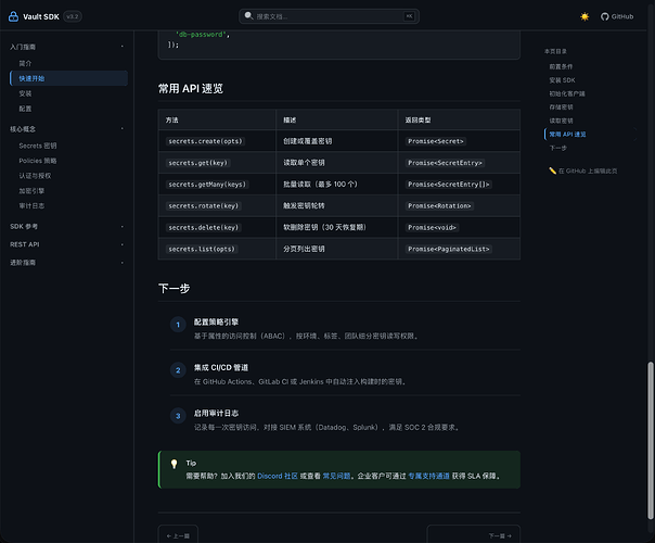
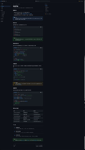
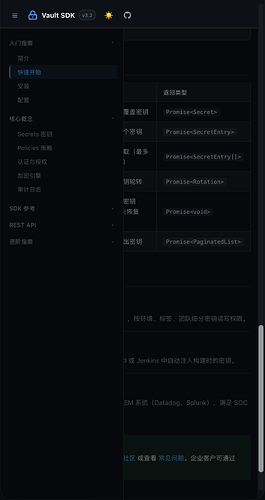
设计一个面向开发者的技术文档站点
设计一个个人账户设置页面
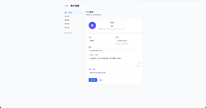
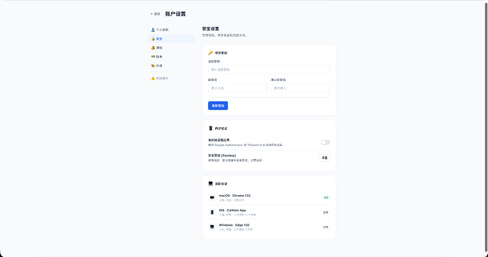
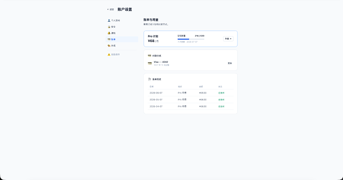
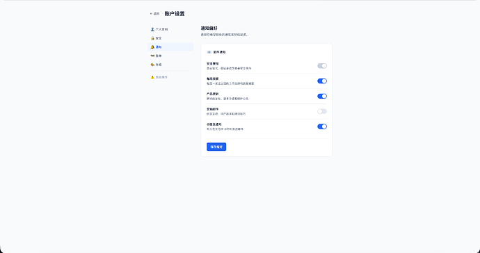
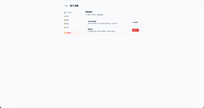
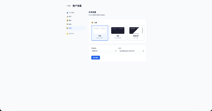
设计一个电商后台的订单管理页面
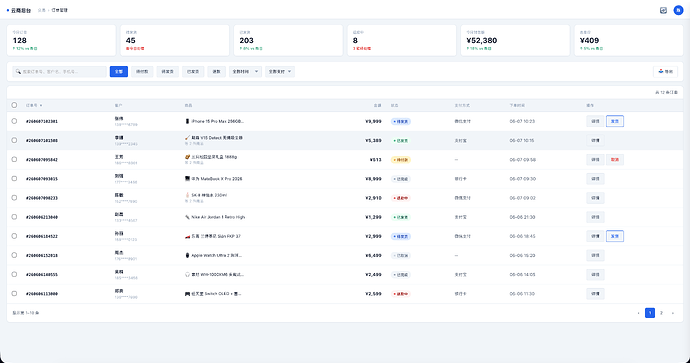
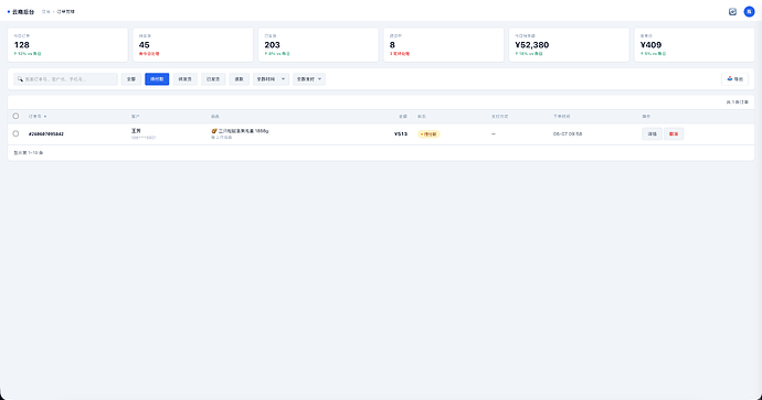
-
 chen7474 06-07 17:255楼
笑死,我让codex生成ui图然后给claude去生成代码,效果还行,审美在线
-
 bizyuyanke 06-07 17:416楼
看的我马上充值10 元deepseek 试试
-
 kristenqin 06-07 17:517楼
配色可以直接去动漫里面抽 tokens 目测过效果还不错
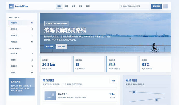
圆角可以全干掉 默认直角或者值小一点 有需要的时候加圆角(权威信息用圆角真的很削弱)
另外很奇怪为啥投喂 ai 这么多文本资料产出效果还是这么奇怪(ds 竟然也喜欢用灰蓝色配色来搞就很诡异)
-
 qwyan 06-07 17:548楼
佬,如果可以的话,可以把skill打包成一个zip压缩包啥的嘛,球球了
-
heidi 楼主 06-07 18:019楼
component-patterns
Component Patterns
These are structural templates, not style prescriptions. The HTML structure, Alpine.js directives, and ARIA patterns are what you copy. The concrete values for colors (
blue-600), spacing (px-6 py-2.5), border radius (rounded-lg), and shadows (shadow-sm) are placeholders. Replace them with the design decisions from SKILL.md Parts 2-5 for your specific project.
Buttons
Variant System (Exactly 3-4)
<!-- Primary -->

<button class="inline-flex items-center gap-2 px-6 py-2.5 text-sm font-semibold

               text-white bg-blue-600 rounded-lg

               hover:bg-blue-700 focus:outline-none focus:ring-2 focus:ring-blue-500 focus:ring-offset-2

               transition-colors duration-150 disabled:opacity-50 disabled:cursor-not-allowed">

  Primary Action

</button>


<!-- Secondary -->

<button class="inline-flex items-center gap-2 px-6 py-2.5 text-sm font-semibold

               text-gray-700 bg-white border border-gray-300 rounded-lg

               hover:bg-gray-50 focus:outline-none focus:ring-2 focus:ring-blue-500 focus:ring-offset-2

               transition-colors duration-150">

  Secondary

</button>


<!-- Tertiary (link-style) -->

<button class="inline-flex items-center gap-2 px-3 py-2 text-sm font-medium

               text-blue-600 hover:text-blue-800 hover:bg-blue-50 rounded-lg

               focus:outline-none focus:ring-2 focus:ring-blue-500 focus:ring-offset-2

               transition-colors duration-150">

  Text Action

</button>


<!-- Danger (only when primary destructive action) -->

<button class="inline-flex items-center gap-2 px-6 py-2.5 text-sm font-semibold

               text-white bg-red-600 rounded-lg

               hover:bg-red-700 focus:outline-none focus:ring-2 focus:ring-red-500 focus:ring-offset-2

               transition-colors duration-150">

  Delete

</button>
Size Hierarchy (Padding NOT Proportional)
sm: px-4 py-2 text-xs    — tight (tables, toolbars)

md: px-6 py-2.5 text-sm  — default

lg: px-8 py-3.5 text-base — generous (hero CTA)
Large buttons get disproportionately more padding; small buttons get disproportionately less.
Placement
- Forms: primary on the right, secondary on the left
- Modals: cancel left, confirm right (
flex justify-end gap-3) - Cards: primary first, secondary below
- Hero: primary CTA left, secondary right
Input Fields
<div>

  <label for="email" class="block text-sm font-medium text-gray-700 mb-1.5">

    Email address

  </label>

  <input type="email" id="email"

    class="block w-full rounded-lg border border-gray-300 px-3.5 py-2.5 text-sm text-gray-900

           placeholder:text-gray-400

           focus:border-blue-500 focus:ring-1 focus:ring-blue-500

           disabled:bg-gray-50 disabled:text-gray-500" />

  <p class="text-sm text-gray-500 mt-1.5">Helper text</p>

  <p class="text-sm text-red-600 mt-1.5">Error message</p>

</div>
- Label above input, never placeholder-only
- Input height:
py-2.5(40px total)
Cards
<div class="bg-white rounded-xl border border-gray-200 shadow-sm p-6

            hover:shadow-md transition-shadow">

  <h3 class="text-lg font-semibold text-gray-900">Card Title</h3>

  <p class="text-sm text-gray-600 mt-2 leading-relaxed">Description</p>

</div>
Tables
<div class="overflow-x-auto rounded-xl border border-gray-200 shadow-sm">

  <table class="min-w-full divide-y divide-gray-200">

    <thead class="bg-gray-50">

      <tr>

        <th class="px-6 py-3 text-left text-xs font-medium text-gray-500 uppercase tracking-wider">Name</th>

        <th class="px-6 py-3 text-right text-xs font-medium text-gray-500 uppercase tracking-wider">Amount</th>

      </tr>

    </thead>

    <tbody class="divide-y divide-gray-200 bg-white">

      <tr class="hover:bg-gray-50 transition-colors">

        <td class="whitespace-nowrap px-6 py-4 text-sm font-medium text-gray-900">Item</td>

        <td class="whitespace-nowrap px-6 py-4 text-sm text-gray-600 text-right">$1,000</td>

      </tr>

    </tbody>

  </table>

</div>
Navigation
<header class="sticky top-0 z-50 bg-white/80 backdrop-blur-md border-b border-gray-200">

  <div class="mx-auto max-w-7xl px-4 sm:px-6 lg:px-8">

    <div class="flex h-16 items-center justify-between">

      <a href="/" class="text-lg font-bold text-gray-900">Logo</a>

      <nav class="hidden md:flex items-center gap-1">

        <a href="#" class="px-3 py-2 text-sm font-medium text-gray-600 hover:text-gray-900 rounded-lg hover:bg-gray-100">Home</a>

        <a href="#" class="px-3 py-2 text-sm font-medium text-gray-900 bg-gray-100 rounded-lg">Active</a>

      </nav>

      <div class="hidden md:flex items-center gap-3">

        <a href="#" class="px-4 py-2 text-sm font-semibold text-white bg-blue-600 rounded-lg hover:bg-blue-700">CTA</a>

      </div>

    </div>

  </div>

</header>
Modals
<div class="fixed inset-0 z-50 bg-black/50 backdrop-blur-sm"></div>

<div class="fixed inset-0 z-50 flex items-center justify-center p-4">

  <div class="bg-white rounded-2xl shadow-xl max-w-md w-full p-6">

    <h3 class="text-lg font-semibold text-gray-900">Dialog Title</h3>

    <p class="text-sm text-gray-600 mt-2">Description</p>

    <div class="flex justify-end gap-3 mt-6">

      <button class="...secondary...">Cancel</button>

      <button class="...primary...">Confirm</button>

    </div>

  </div>

</div>
Empty States
<div class="flex flex-col items-center justify-center py-16 px-4 text-center">

  <div class="w-16 h-16 rounded-full bg-gray-100 flex items-center justify-center mb-4">

    <!-- icon, text-gray-400 -->

  </div>

  <h3 class="text-base font-semibold text-gray-900">No items found</h3>

  <p class="text-sm text-gray-500 mt-2 max-w-sm">Get started by creating your first item.</p>

  <button class="mt-6 ...primary...">Create Item</button>

</div>
Badges
<span class="inline-flex items-center rounded-full bg-gray-100 px-2.5 py-0.5 text-xs font-medium text-gray-700">

  Draft

</span>
Use
bg-{color}-50 text-{color}-700pattern for semantic badges (green/success, red/error, yellow/warning, blue/info).
Alerts
<div class="rounded-lg bg-blue-50 border border-blue-200 p-4">

  <div class="flex items-start gap-3">

    <svg class="w-5 h-5 text-blue-600 mt-0.5 flex-shrink-0">...</svg>

    <div>

      <h3 class="text-sm font-medium text-blue-800">Info</h3>

      <p class="text-sm text-blue-700 mt-1">Message text.</p>

    </div>

  </div>

</div>
Tabs
<div class="border-b border-gray-200">

  <nav class="flex -mb-px gap-0">

    <button class="px-4 py-3 text-sm font-medium text-blue-600 border-b-2 border-blue-600">Active</button>

    <button class="px-4 py-3 text-sm font-medium text-gray-500 border-b-2 border-transparent hover:text-gray-700 hover:border-gray-300">Tab 2</button>

  </nav>

</div>
Pagination
<nav class="flex items-center justify-between border-t border-gray-200 pt-4 mt-8">

  <p class="text-sm text-gray-600">Showing <span class="font-medium">1</span> to <span class="font-medium">10</span> of <span class="font-medium">97</span></p>

  <div class="flex items-center gap-1">

    <a href="#" class="px-3 py-2 text-sm font-medium text-white bg-blue-600 rounded-lg">1</a>

    <a href="#" class="px-3 py-2 text-sm font-medium text-gray-600 rounded-lg hover:bg-gray-100">2</a>

  </div>

</nav>
Dropdown Menu
<div class="relative" x-data="{ open: false }">

  <button @click="open = !open" class="...primary...">

    Actions

  </button>

  <div x-show="open" @click.outside="open = false"

       class="absolute right-0 mt-2 w-48 bg-white rounded-xl border border-gray-200 shadow-md z-50 py-1">

    <a href="#" class="block px-4 py-2 text-sm text-gray-700 hover:bg-gray-50">Edit</a>

    <a href="#" class="block px-4 py-2 text-sm text-gray-700 hover:bg-gray-50">Duplicate</a>

    <hr class="my-1 border-gray-100" />

    <a href="#" class="block px-4 py-2 text-sm text-red-600 hover:bg-red-50">Delete</a>

  </div>

</div>
Progress Indicator
<!-- Step indicator -->

<nav aria-label="Progress" class="flex items-center gap-2">

  <span class="flex items-center gap-2 text-sm font-medium text-blue-600">

    <span class="w-6 h-6 rounded-full bg-blue-600 text-white text-xs flex items-center justify-center">1</span> Account

  </span>

  <span class="w-8 h-px bg-blue-600"></span>

  <span class="flex items-center gap-2 text-sm font-medium text-blue-600">

    <span class="w-6 h-6 rounded-full bg-blue-600 text-white text-xs flex items-center justify-center">2</span> Shipping

  </span>

  <span class="w-8 h-px bg-gray-300"></span>

  <span class="flex items-center gap-2 text-sm text-gray-500">

    <span class="w-6 h-6 rounded-full border-2 border-gray-300 text-gray-500 text-xs flex items-center justify-center">3</span> Payment

  </span>

</nav>


<!-- Linear progress bar -->

<div class="w-full bg-gray-200 rounded-full h-2">

  <div class="bg-blue-600 h-2 rounded-full transition-all duration-300" style="width: 60%"></div>

</div>
Toast Notification
<div class="fixed bottom-4 right-4 z-50 max-w-sm bg-white rounded-xl border border-gray-200 shadow-lg p-4

            animate-[slideUp_0.3s_ease-out]">

  <div class="flex items-start gap-3">

    <svg class="w-5 h-5 text-green-600 mt-0.5 flex-shrink-0">...</svg>

    <div class="flex-1">

      <p class="text-sm font-medium text-gray-900">Changes saved</p>

      <p class="text-sm text-gray-500 mt-0.5">Your profile has been updated.</p>

    </div>

    <button class="text-gray-400 hover:text-gray-600 flex-shrink-0">✕</button>

  </div>

</div>
Tooltip
<div class="relative group">

  <button class="...">Hover me</button>

  <div class="absolute bottom-full left-1/2 -translate-x-1/2 mb-2 px-3 py-1.5 bg-gray-900 text-white text-xs rounded-lg

              opacity-0 group-hover:opacity-100 transition-opacity duration-150 pointer-events-none whitespace-nowrap">

    Tooltip text

    <div class="absolute top-full left-1/2 -translate-x-1/2 -mt-px border-4 border-transparent border-t-gray-900"></div>

  </div>

</div>
Accordion
Use for content lists where users scan questions and expand only what they need (FAQs, help sections, feature details).
Rule: Each accordion item gets a single bottom border line — no cards, no colored backgrounds, no shadows. The interaction indicator (chevron) should be lighter than the question text.
<div class="max-w-2xl mx-auto divide-y divide-gray-200">

  <div x-data="{ open: false }" class="py-4">

    <button @click="open = !open"

            class="flex items-center justify-between w-full text-left text-base font-semibold text-gray-900 hover:text-gray-700 transition-colors">

      <span>What is the return policy?</span>

      <svg class="w-5 h-5 text-gray-400 flex-shrink-0 ml-4 transition-transform duration-200"

           :class="{ 'rotate-180': open }"

           fill="none" stroke="currentColor" viewBox="0 0 24 24">

        <path stroke-linecap="round" stroke-linejoin="round" stroke-width="2" d="M19 9l-7 7-7-7"/>

      </svg>

    </button>

    <div x-show="open" x-collapse class="mt-3 text-sm text-gray-600 leading-relaxed">

      Answer content here. Keep line length comfortable (max-w-prose).

    </div>

  </div>

  <!-- repeat for each item -->

</div>
Key characteristics:
- Items separated by single
divide-yline (gray-200), no card wrappers - Question text = bold, dark; chevron icon = lighter gray than the text
- Chevron rotates 180° on open (not a different icon)
- Answer text = regular weight, slightly smaller or same size, with comfortable line height
- No background color change on hover or open — keep it flat
When NOT to use accordions: When users need to see all content simultaneously (use sections with headings instead). Accordions hide content; only use them when scanning-and-expanding is the dominant user behavior.
layout-patterns
Layout Patterns
When to use which pattern
Layout choices depend on behavior and density (see SKILL.md Part 0). This file catalogs common patterns with the conditions under which each is appropriate.
Page Archetypes
1. Hero + Sections (Marketing / Landing)
When: behavior = scan or decide, density = focused or mixed
<section class="py-16 md:py-24">

  <div class="mx-auto max-w-7xl px-4 sm:px-6 lg:px-8">

    <!-- Hero text: max-w-2xl or max-w-3xl, centered or left-aligned -->

    <!-- Feature cards: responsive grid -->

  </div>

</section>
Key characteristics: constrained content width, generous vertical rhythm, section background alternation (white → gray-50 → white).
2. Content + Sidebar
When: behavior = read + browse (e.g., docs with nav, e-commerce with filters)
<div class="mx-auto max-w-7xl px-4 sm:px-6 lg:px-8 py-12">

  <div class="flex gap-8">

    <aside class="w-64 flex-shrink-0 hidden lg:block">

      <nav class="sticky top-24">...</nav>

    </aside>

    <main class="flex-1 min-w-0">

      <article class="max-w-prose">...</article>

    </main>

  </div>

</div>
Fixed sidebar width is correct here because the sidebar’s content width doesn’t vary with viewport size.
w-64stays 256px; the reader doesn’t benefit from a wider navigation panel on a larger screen.
Exception: When both panels contain equal-priority content (e.g., email: folder list + message list), proportional widths may be more appropriate.
3. Dashboard / Tool
When: behavior = operate, density = overview
┌──────────────────────────────────────────────────────┐

│  Fixed sidebar (w-56 to w-64) │   Main content area  │

│  Navigation, filters          │   Panels, data, cards│

│                               │                      │

│  (sticky, full height)        │  (flex fill width)   │

└──────────────────────────────────────────────────────┘
<div class="flex min-h-screen">

  <aside class="fixed inset-y-0 left-0 z-40 w-64 bg-gray-900 hidden lg:block">

    <!-- fixed sidebar, dark in many tools but depends on context -->

  </aside>

  <div class="lg:pl-64 flex-1 min-w-0">

    <header class="sticky top-0 h-16 bg-white border-b flex items-center px-6">...</header>

    <main class="p-6">

      <div class="grid grid-cols-1 sm:2 lg:4 gap-6"><!-- stat cards --></div>

      <!-- panels fill available width, no max-width on container -->

    </main>

  </div>

</div>
Key differences from content layouts:
- No outer max-width (or very generous max-w-7xl). Content panels fill available space.
- Compact spacing (p-3 to p-4, gap-3 to gap-4)
- Sticky headers and sidebars for persistent access
- Borders used where spacing alone isn’t enough (data-dense areas)
4. Centered Form / Auth
When: behavior = decide, density = focused
<div class="min-h-screen flex items-center justify-center px-4 py-12 bg-gray-50">

  <div class="w-full max-w-md">

    <div class="bg-white rounded-2xl shadow-sm border p-6 sm:p-8">

      <!-- form -->

    </div>

  </div>

</div>
Form width constrained (max-w-md to max-w-lg) because forms don’t benefit from stretching. The task is linear — no scanning benefit from extra width.
5. Multi-Column Dispatch / Operations Console
When: behavior = operate, density = overview, multiple simultaneous workflows
┌────────────┬──────────────────┬──────────────┐

│  Pending   │   Route Builder  │   Active     │

│  Items     │   (Primary       │   Routes     │

│  (List)    │    workspace)    │   (Monitor)  │

│            │                  │              │

│ scrollable │   flex-fills     │  scrollable  │

└────────────┴──────────────────┴──────────────┘
Each column has a fixed-ish width. Left and right panels are fixed or min-width; center flexes. All three fill the viewport height. No outer max-width — the grid extends to screen edges.
When to Use Grid vs Flex vs Fixed
Situation
Approach
Because
Equal card grid
gridwith responsive columns
Cards should scale proportionally within the grid
Sidebar + content
flexwith fixed sidebar, flex-1 main
Sidebar should not grow with viewport
50/50 split (equal panels)
grid grid-cols-2
Both halves scale together
Form
max-w-lgormax-w-xl
Form stays readable regardless of screen
Centered CTA block
max-w-2xl mx-auto text-center
Content-driven width
Nav links
flex gap-*
Links have intrinsic sizes
Dashboard panels
Grid or flex, fill container
Varies by panel type
Data table
Full width of its container
Tables need all available width
Section Alternation
For long pages with multiple sections, alternate backgrounds instead of using borders:
white → gray-50 → white → gray-50 → white
This creates visual zones without adding separator lines.
Within-Group vs Between-Group Spacing
Invariant rule: More space around a group than within it.
Form fields:

  label      ↑

  6px gap    ← within group

  input      ↓

  24px        ← between groups

  label      ↑

  6px gap

  input      ↓
The precise values adjust by density tier (see SKILL.md Part 2), but the ratio (between ≥ 2× within) is invariant.
The “Don’t Fill the Screen” Principle — Context Matters
This principle applies when:
- The user’s primary task is reading continuous content
- The natural content width is less than the available viewport width
- Extra width provides no functional benefit
This principle does NOT apply when:
- The user’s task is monitoring, comparing, or managing multiple items
- The interface is a tool where information density adds value
- Extra width allows more data to be visible simultaneously
When in doubt: if the page is a tool (dashboard, console, editor, spreadsheet), err toward filling width. If the page is content (article, form, landing), err toward constraining width.
Image-Dominant Layout
When: behavior = browse or decide, one side has a dominant visual element (product photo, illustration, hero image) and the other side has supporting text/options. This is the layout pattern behind Apple’s product configurator pages.
┌──────────────────────────────┬──────────┐

│                              │          │

│   Large product image        │ Options  │

│   or hero illustration       │ Text     │

│                              │ Selectors│

│                              │          │

└──────────────────────────────┴──────────┘

          ~65-70%                ~30-35%
<div class="flex items-center gap-8 md:gap-16 max-md:flex-col">

  <div class="flex-1 max-w-2xl">

    <!-- Large product image, illustration, or visual -->

  </div>

  <div class="w-72 md:w-80 flex-shrink-0">

    <!-- Supporting text, config options, color selectors -->

  </div>

</div>
Key characteristics:
- The dominant side captures attention through size, not color or animation
- The subordinate side is narrow (fixed width, not flex) — it doesn’t grow with the viewport
- On mobile, stacks vertically with the image first
- Example: Apple product configurator pages (MacBook + color picker)
Do NOT use when: both sides carry equal importance. Use
grid grid-cols-2for equal-weight splits.
Grouped vs Ungrouped Backgrounds
When: behavior = scan, multiple sections with different purposes need visual separation without borders. Apple’s HIG distinguishes between “ungrouped” (flat, solid white) and “grouped” (gray background with white cell cards) layouts — a formalization of the alternation principle.
┌──────────────────────────────────────┐

│  Section A: white/light background   │

│  (e.g., product intro, hero)         │

├──────────────────────────────────────┤

│  Section B: vibrant block background │

│  (e.g., promotion, services, CTA)    │

├──────────────────────────────────────┤

│  Section C: white/light background   │

│  (e.g., details, footer)             │

└──────────────────────────────────────┘
Rule: Distinct purposes → distinct background treatments. No borders, no shadows — the color shift is the separator.
- Neutral sections (intro, details): white or gray-50
- Promotional/highlight sections: a single, confident background color that contrasts with neighbors
- When using a colored section background, ensure text contrast passes WCAG AA against it
<section class="bg-gray-50 py-16">...</section>

<section class="bg-blue-600 py-16 text-white">...</section>

<section class="bg-white py-16">...</section>
This is the stronger form of the basic “white → gray-50 → white” alternation. Reserve the bold background color for sections that carry a different message or emotional tone from their neighbors.
Counter-indication: In dashboards and tools (behavior = operate), background shifts can distract. Prefer uniform backgrounds with spacing-based grouping.
typography
Typography
Based on Refactoring UI (Wathan & Schoger), Don’t Make Me Think (Krug), and Practical Typography (Butterick).
The Four Most Important Typographic Choices
For body text: point size, line spacing, line length, and font. These four determine everything.
- Point size: 15-25px on the web. 16px is the safe default.
- Line spacing: 120-145% of point size. 1.5 is a good starting point.
- Line length: 45-90 characters including spaces. 65 is ideal.
- Font: Use a professional font (see below).
Hand-crafted, not mathematical. Tailwind equivalents:
text-xs:   12px / 1rem    → captions, badges, footnotes

text-sm:   14px / 1.25rem → secondary text, labels, helpers

text-base: 16px / leading-relaxed (1.625) → body text (NEVER smaller)

text-lg:   18px / leading-relaxed → subtitle, card description

text-xl:   20px / 1.75rem → card title

text-2xl:  24px / 2rem    → section subheading

text-3xl:  30px / 2.25rem → section heading

text-4xl:  36px / 2.5rem  → page title

text-5xl:  48px / 1       → hero (landing only)

text-6xl:  60px / 1       → hero (landing only)
Use
pxorrem, neverem— nestedemvalues produce sizes outside your scale.
Line Height
Inversely proportional to font size:
Size
Line Height
Tailwind
12-14px
1.5-1.6
leading-normalor custom
16px
1.5-1.75
leading-relaxed(1.625)
18-20px
1.4-1.5
leading-normal(1.5)
24-30px
1.25-1.3
leading-tight(1.25)
36-48px
1.1-1.2
leading-tightorleading-none
60px+
1.0-1.1
leading-none
Also proportional to line width: wider text needs taller line-height. At 75 characters, use ~1.6; at 45 characters, 1.4 is fine.
Font Selection
System Font Stack (Recommended for Body)
font-family: -apple-system, BlinkMacSystemFont, "Segoe UI", Roboto,

             "Helvetica Neue", Arial, "Noto Sans", sans-serif;
This is Tailwind’s default
font-sans. Fastest, most readable, zero download.
Web Font Quality Filter
- Only consider fonts with 5+ weights (including italics) — fewer weights often means less care
- Sort by popularity on font directories
- Avoid condensed fonts with short x-heights for body text
- Steal from well-designed sites (Linear, Stripe, Vercel)
Proven Pairings
Heading
Body
Vibe
Inter
Inter
Neutral, modern SaaS
Plus Jakarta Sans
Inter
Friendly, warm
DM Serif Display
DM Sans
Editorial, elegant
Space Grotesk
DM Sans
Geometric, tech
Always set
font-display: swapand provide fallbacks. Only load weights you actually use (400, 500, 600, 700).
Alignment
- Body text: always left-aligned (start-aligned)
- Short headlines: center-align OK (≤2 lines)
- Numbers in tables: right-align (decimals align)
- Justified text: only with hyphenation, only for print-style layouts
- Mixed font sizes on one line: align by baseline (
items-baseline), NOT center
Links
In link-heavy interfaces (nav, lists): don’t color every link. Use heavier font weight or darker color instead. For ancillary links, add color/underline only on hover.
Letter-Spacing
Context
Value
Tailwind
Headings
-0.02em
tracking-tight
Hero text
-0.03em
tracking-tighter
All-caps text
+0.05em
tracking-widest
Body text
0
default
Additional Rules from Practical Typography
- Curly quotes, not straight quotes. Use
“”‘’for proper typography. - Use bold or italic sparingly, and not together. They serve different purposes; combining them is redundant.
- Never underline except for web links.
- All caps: fine for less than one line. Any longer and readability drops sharply.
- One space between sentences, never two.
- 5-12% extra letterspacing with all caps and small caps.
- First-line indents or paragraph spacing — not both. Choose one method for separating paragraphs.
- Always hyphenate justified text. Without hyphenation, justified text creates rivers of whitespace.
- Hyphens (-) ≠ en dashes (–) ≠ em dashes (—). Hyphens join words. En dashes show ranges (9–5). Em dashes set off phrases.
- Ellipsis is one character (…), not three periods. Use
…or the Unicode character. - One exclamation point is plenty in a document longer than three pages.
Responsive Typography
Body text stays
text-base(16px) at ALL breakpoints. Headings scale:
H1: text-3xl md:text-4xl lg:text-5xl

H2: text-2xl md:text-3xl

H3: text-xl md:text-2xl
The headline-to-body ratio should be smaller on mobile than desktop. Don’t encode it with
em— size independently at each breakpoint.
- ↑最近codex经常性出现错误”Transport error: network error: error decoding response body“
- ↑掉了三级,邮箱收不到邮件了,是限制了吗,升到三级后,自动恢复吗
- ↑德国沃达丰添加提示激活码无效
- ↑香港clubsim在线申请esim并写入白卡(不要求在香港)
- ↑发5个蟹黄堡的药
- 📍 ui设计skill分享,适用于deepseek。codex救不回来了,没有艺术细胞的东西
- ↓【GPT_Image_Playground】纯前端的 GPT-Image-2 API 调用 WebUI,参数齐全,功能完备,一上手就被吓到眩晕瘫坐,那一刻就像看到原子弹爆炸!
- ↓正式启动! 在论坛结束3级用户邀请系统的当天,我向一位外国友人发出了邀请
- ↓听说 A\ 要开放 Mythos 模型了?
- ↓【4Router】Claude分组低至0.4x!每10楼抽3个5刀额度!
- ↓Notion: Anthropic 旗下 Claude Opus 4.7和4.8 模型性能下降/降智
heidi
|
主题数 1 |
帖子数 1 |
注册排名 3 |