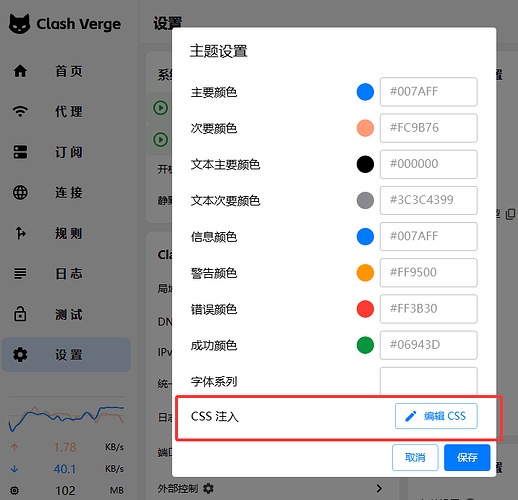
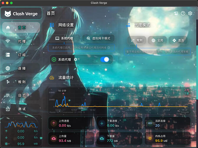
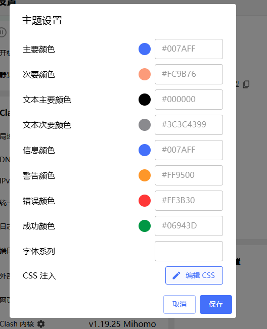
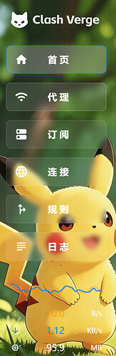
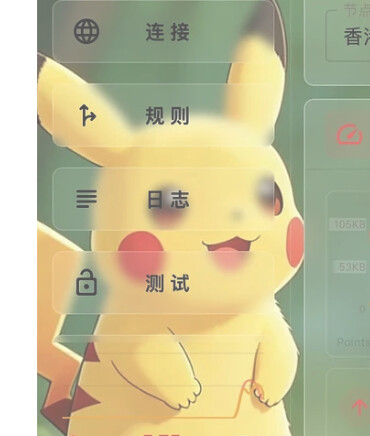
做了个clash verge 的宝可梦主题,css 直接放在下方,喜欢的佬可以自取
^-^^-^^-^clash verge 版本:v2.5.1
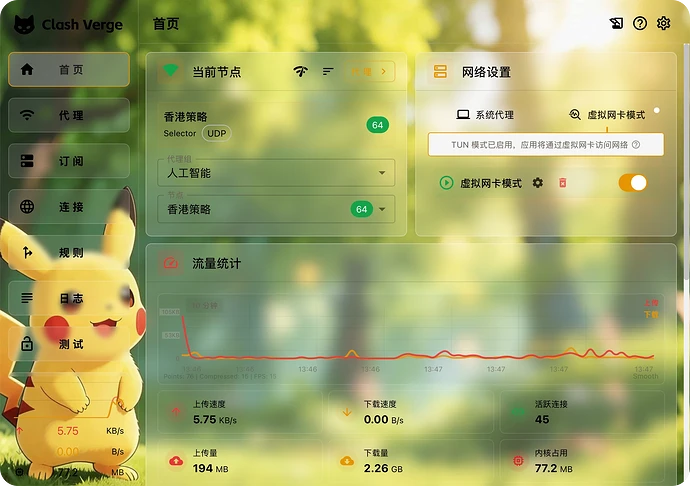
主色: #E69500
次色: #E53935
主文字色: #2A2722
次文字色: #6B6358
信息色: #0284C7
警告色: #F59E0B
错误色: #DC2626
成功色: #16A34A
/* =========================================

   自定义新背景图 & 全局透明(高级毛玻璃版 - 涵盖所有悬浮层)

   ========================================= */


/* 1. 设置全新全局背景图片 */

body {

  background-image: url('https://s1.imagehub.cc/images/2026/06/30/f61fe40acc4fa8e2cadbc7d2e8f8bdd9.jpg') !important;

  background-size: cover !important;

  background-position: center !important;

  background-repeat: no-repeat !important;

  background-attachment: fixed !important;

}


/* 2. 剥离应用骨架及虚拟滚动外层容器的实体背景,让底层图片透出

      (优化:排除弹窗、右键菜单、下拉层,防止悬浮层全透明) */

.layout,

.MuiPaper-root:not(.MuiDialog-paper):not(.MuiMenu-paper):not(.MuiPopover-paper),

.layout-content__left,

.base-page > header,

.base-page .base-container,

.base-page .base-container > section,

.base-content div[data-index] {

  background-color: transparent !important;

  background: transparent !important;

  border-color: rgba(255, 255, 255, 0.1) !important;

}


/* 3. 🌟 弹窗、对话框、右键菜单:高级毛玻璃质感(Glassmorphism) */

.MuiDialog-paper,

.MuiMenu-paper,

.MuiPopover-paper {

  background: rgba(255, 255, 255, 0.45) !important; /* 降低不透明度,让背景隐约透过来 */

  background-color: rgba(255, 255, 255, 0.45) !important;

  backdrop-filter: blur(24px) saturate(150%) !important; /* 强模糊 + 提升色彩饱和度,防止文字混浊 */

  border: 1px solid rgba(255, 255, 255, 0.5) !important;

  border-radius: 12px !important; /* 让菜单的圆角更现代一点 */

  /* 外部阴影提升悬浮感,内部白色发光模拟玻璃边缘高光 */

  box-shadow: 0 16px 48px rgba(0, 0, 0, 0.15), inset 0 1px 2px rgba(255, 255, 255, 0.8) !important;

}

/* 确保弹窗内部的输入框和多选框在玻璃底上清晰 */

.MuiDialog-paper .MuiOutlinedInput-notchedOutline {

  border-color: rgba(0, 0, 0, 0.2) !important;

}


/* 4. 右侧普通主内容区模块(首页卡片、设置页模块、订阅卡片、代理页模块等)应用常规轻微毛玻璃 */

.base-content [class*="MuiGrid"] > .MuiBox-root:has(.MuiTypography-h6),

.base-content [class*="MuiGrid"] > .MuiBox-root:has(.MuiList-root),

.base-content .MuiBox-root[aria-selected],

.base-content div[data-index] > .MuiListItemButton-root,

.base-content .MuiListItemButton-root:has(.the-pin, .the-delay, .the-check, .the-unpin),

.the_titlebar {

  background: rgba(255, 255, 255, 0.15) !important;

  background-color: rgba(255, 255, 255, 0.15) !important;

  backdrop-filter: blur(10px) !important;

  border: 1px solid rgba(255, 255, 255, 0.3) !important;

  box-shadow: 0 4px 12px rgba(0, 0, 0, 0.05) !important;

}


/* 内容模块悬浮态 */

.base-content [class*="MuiGrid"] > .MuiBox-root:has(.MuiTypography-h6):hover,

.base-content [class*="MuiGrid"] > .MuiBox-root:has(.MuiList-root):hover,

.base-content .MuiBox-root[aria-selected]:hover,

.base-content div[data-index] > .MuiListItemButton-root:hover,

.base-content .MuiListItemButton-root:has(.the-pin, .the-delay, .the-check, .the-unpin):hover {

  background: rgba(255, 255, 255, 0.25) !important;

  background-color: rgba(255, 255, 255, 0.25) !important;

  border-color: rgba(255, 255, 255, 0.6) !important;

  box-shadow: 0 8px 24px rgba(0, 0, 0, 0.1) !important;

}


/* 选中态边框高亮 */

.base-content .MuiBox-root[aria-selected="true"],

.base-content .MuiListItemButton-root:has(.the-pin, .the-delay, .the-check, .the-unpin).Mui-selected {

  border-color: var(--primary-main) !important;

  background: rgba(255, 255, 255, 0.3) !important;

  background-color: rgba(255, 255, 255, 0.3) !important;

}


/* 5. 左侧导航菜单选项按钮的透明化与轻微磨砂 */

.the-menu .MuiListItemButton-root {

  background-color: rgba(255, 255, 255, 0.08) !important;

  backdrop-filter: blur(4px) !important;

  border: 1px solid rgba(255, 255, 255, 0.15) !important;

  border-radius: 8px !important;

  margin: 4px 12px !important;

  transition: all 0.2s !important;

}


/* 导航选项按钮悬浮态 */

.the-menu .MuiListItemButton-root:hover {

  background-color: rgba(255, 255, 255, 0.18) !important;

  backdrop-filter: blur(8px) !important;

  border-color: rgba(255, 255, 255, 0.4) !important;

}


/* 导航选项按钮选中态 */

.the-menu .MuiListItemButton-root.Mui-selected {

  background-color: rgba(255, 255, 255, 0.25) !important;

  backdrop-filter: blur(10px) !important;

  border-color: var(--primary-main) !important;

  box-shadow: 0 0 12px rgba(255, 255, 255, 0.15) !important;

}


 GuTeng 06-30 13:521楼
 Mrs 06-30 13:543楼
 洛卡卡了 06-30 13:554楼
 nil 06-30 13:555楼
 nice-L 06-30 13:556楼
 xuanxuan 06-30 13:557楼
 caipi 06-30 13:578楼
 嘿嘿 06-30 14:089楼
 李华 06-30 14:2610楼
 kioo 06-30 14:3211楼
 liuziyi 06-30 14:3412楼
 kingkare 06-30 14:3513楼
 cata 06-30 14:4015楼
 UEFI 06-30 14:4317楼
 老火面 07-01 11:5618楼
 emperor.bei096 08-16 17:0119楼